
dropdown_button2
v2.3.9Flutter's core Dropdown Button widget with steady dropdown menu and many options you can customize to your needs.
Package archive: https://pubdev.letsnova.ru/api/archives/dropdown_button2/2.3.9.tar.gz
Install
dart pub add dropdown_button2Readme
Flutter DropdownButton2



Intro
Flutter's core Dropdown Button widget with steady dropdown menu and many other options you can customize to your needs.
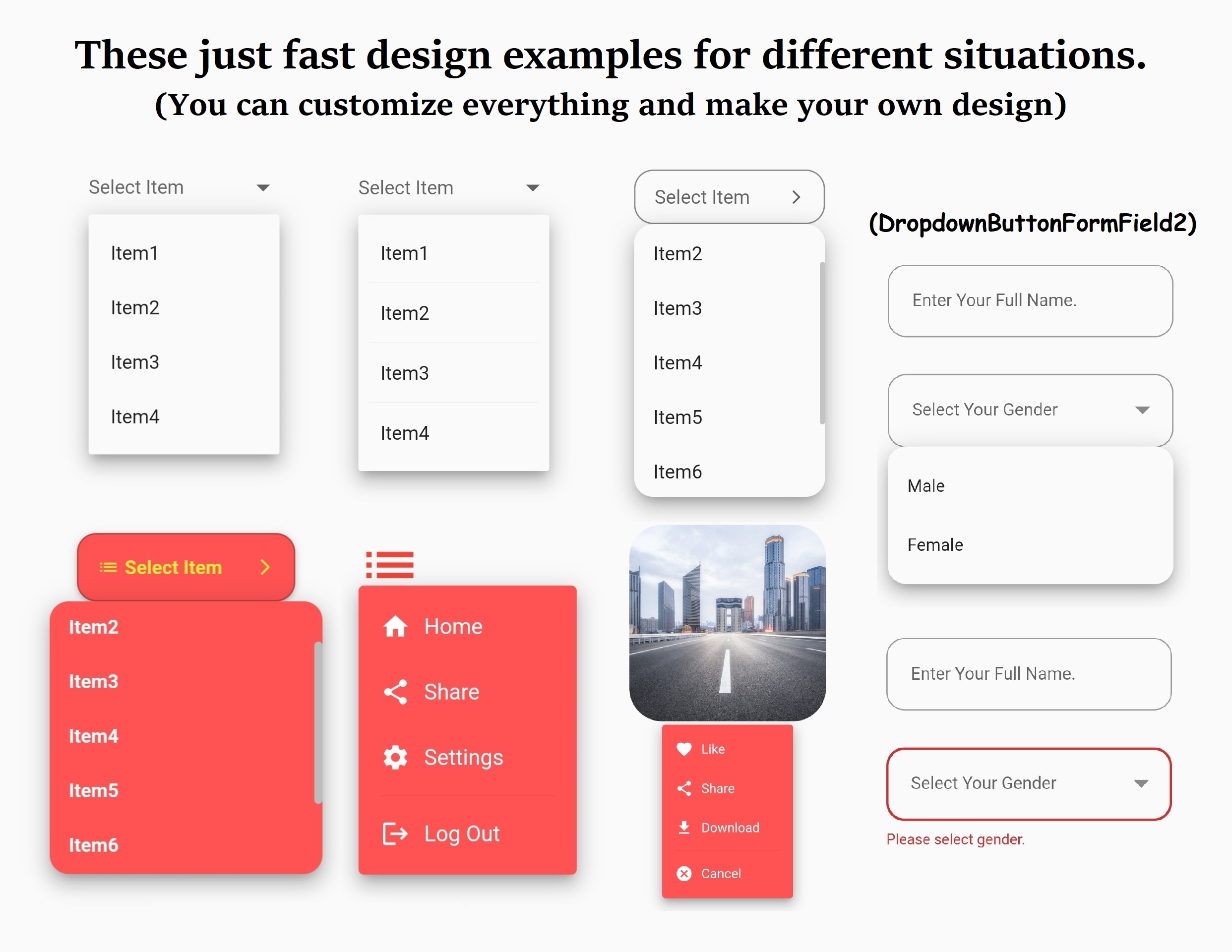
- Features
- Options
- Installation
- Usage and Examples
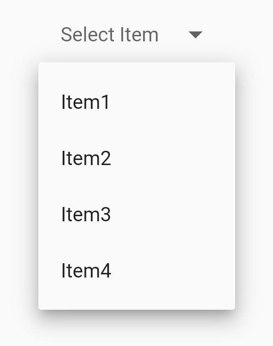
- 1. Simple DropdownButton2 with no styling
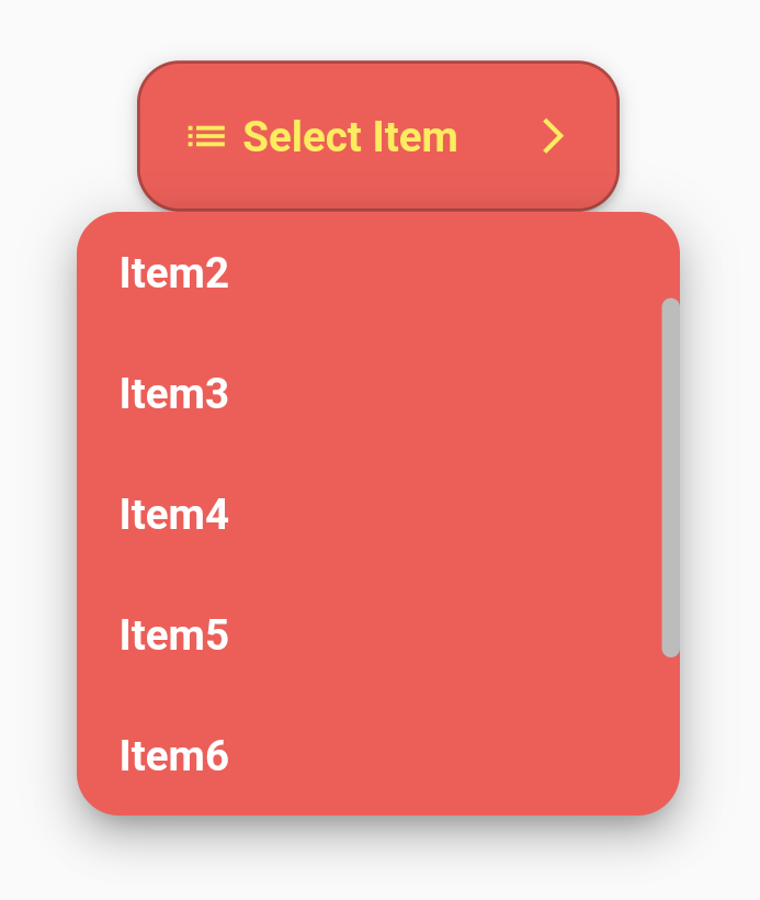
- 2. DropdownButton2 with few styling and customization
- 3. DropdownButton2 with items of different heights like dividers
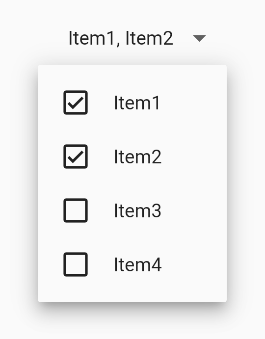
- 4. DropdownButton2 as Multiselect Dropdown with Checkboxes
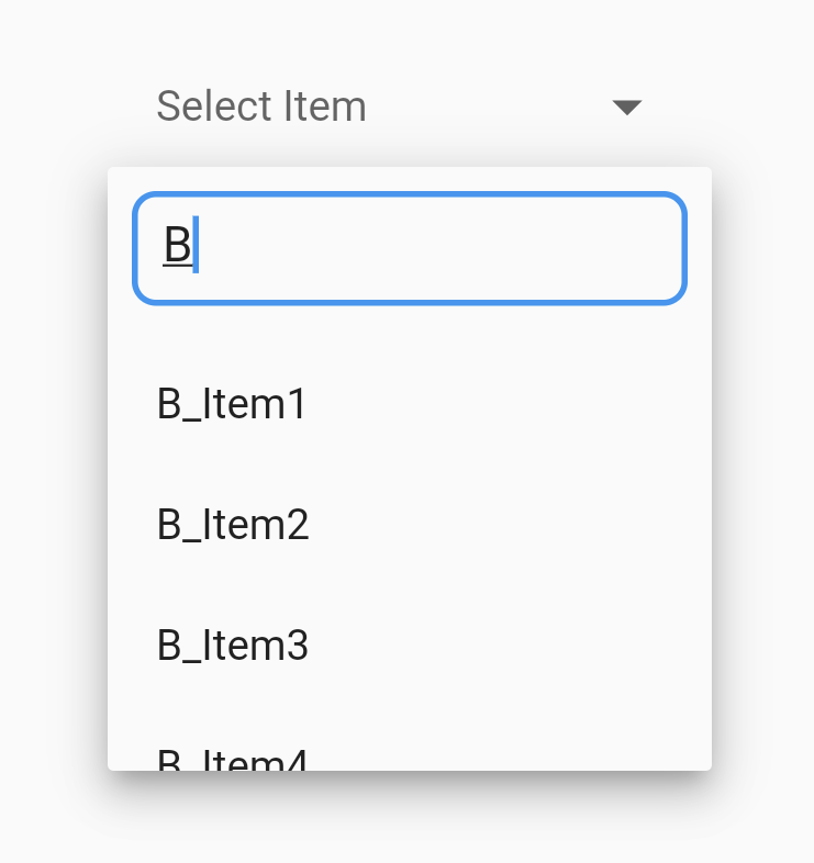
- 5. DropdownButton2 as Searchable Dropdown
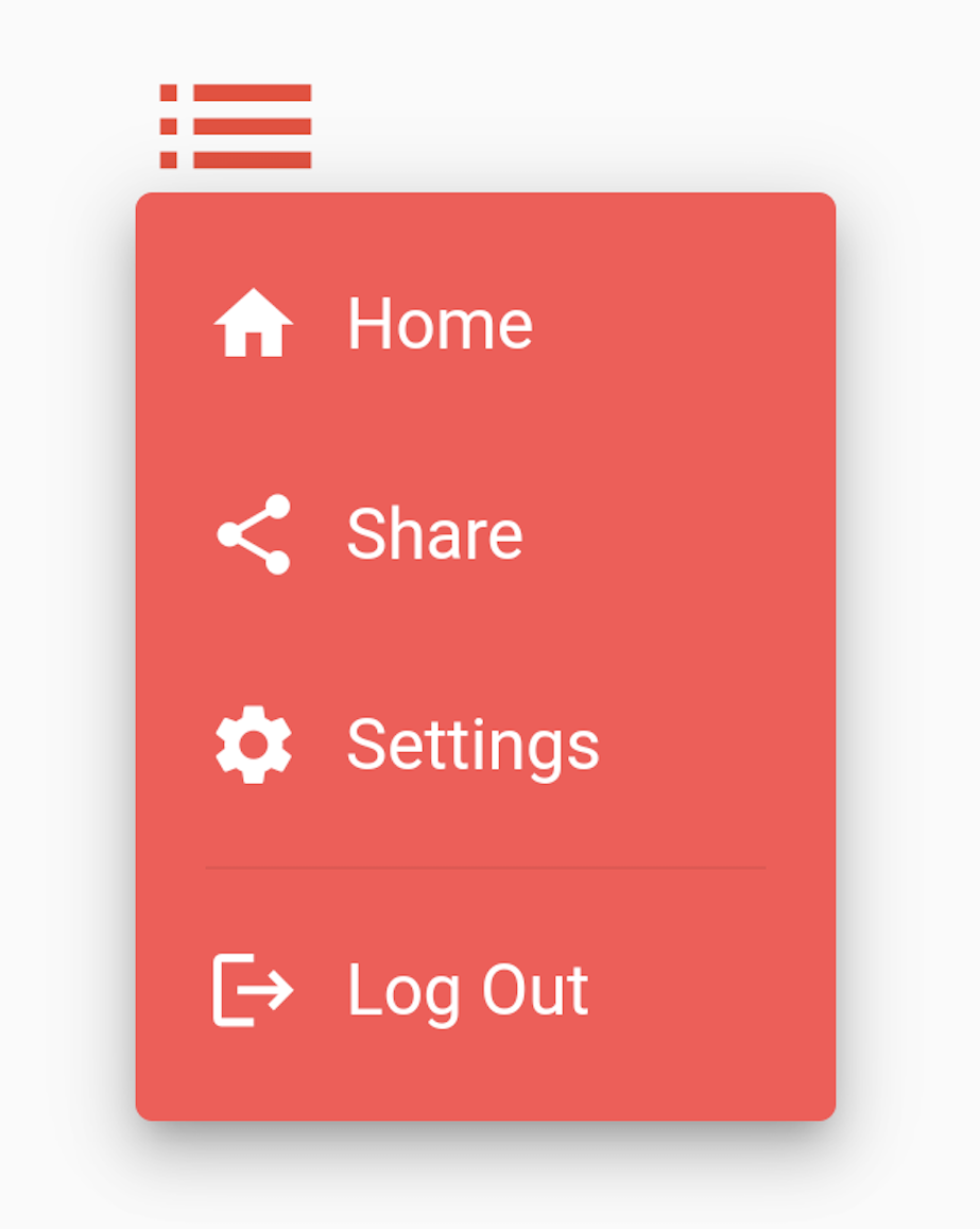
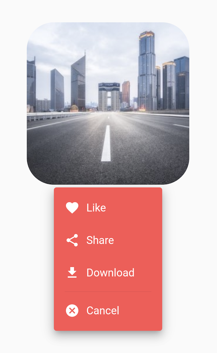
- 6. DropdownButton2 as Popup menu button using customButton parameter
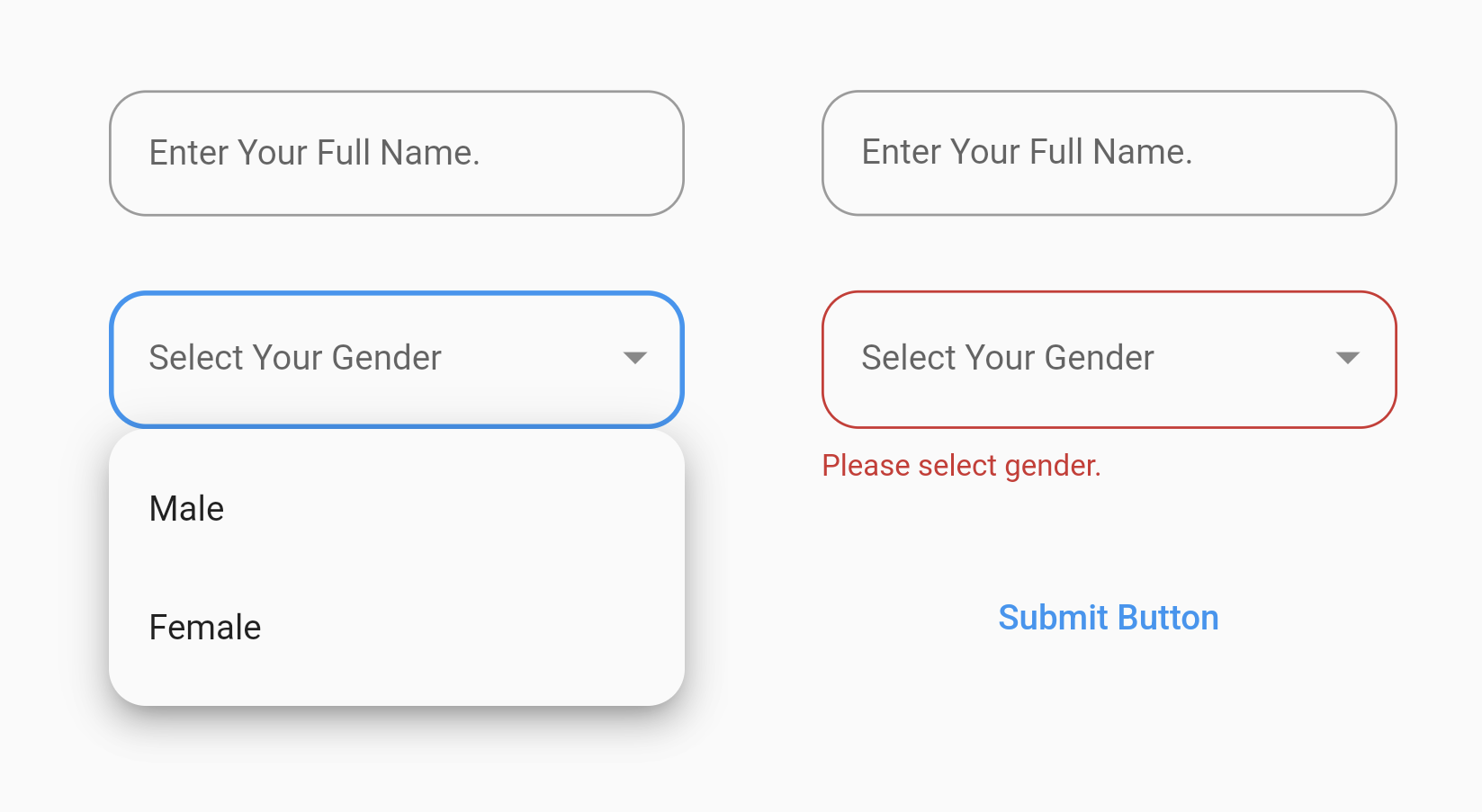
- 7. Using DropdownButtonFormField2 with Form
- CustomDropdownButton2 Widget "customize it to your needs"
Features
- Dropdown menu always open below the button "as long as it's possible otherwise it'll open to the end of the screen" and you can edit its position by using the offset parameter.
- You can control how (button, button's icon, dropdown menu and menu items) will be displayed "read Options below".
- You can align (hint & value) and customize them.
- You can edit the scrollbar's radius,thickness and isAlwaysShow.
- You can set max height for the dropdown menu & it'll become scrollable if there are more items.
- If you pass Null to dropdownMaxHeight parameter or didn't use it, the dropdown menu will take max height possible for the items and will become scrollable if there are more items.
- If you have long scrollable list, the dropdown menu will auto scroll to current selected item and show it at the middle of the menu if possible.
- Wrap DropdownButton2 with DropdownButtonHideUnderline to hide the underline.
- A Custom widget of the DropdownButton2 below to make it more reusable. You can customize it to your needs and use it throughout all your app easily as shown in the examples.
- You can use DropdownButton2 with items of different heights like dividers as shown in the examples.
- You can use DropdownButton2 as Multiselect Dropdown with Checkboxes as shown in the examples.
- You can use DropdownButton2 as Searchable Dropdown as shown in the examples.
- You can use DropdownButton2 as a popup menu button by using the parameter customButton. You can pass Icon,Image or any widget and customize it as shown in the examples.
- You can also use DropdownButtonFormField2 the same way with all options above and use it inside Form as shown in the examples.
- Use decoration parameter for the DropdownButtonFormField2 to add borders, label and more.
- You can customize DropdownButtonFormField2 width by wrapping it with Padding or with SizedBox and give it the width you want.
Options
DropdownButton2:
| Option | Description | Type | Required |
|---|---|---|---|
| items | The list of items the user can select | List<DropdownMenuItem |
Yes |
| selectedItemBuilder | A builder to customize how the selected item will be displayed on the button | DropdownButtonBuilder | No |
| value | The value of the currently selected [DropdownMenuItem] | T | No |
| hint | The placeholder displayed before the user choose an item | Widget | No |
| disabledHint | The placeholder displayed if the dropdown is disabled | Widget | No |
| onChanged | Called when the user selects an item | ValueChanged<T?> | No |
| onMenuStateChange | Called when the dropdown menu opens or closes | OnMenuStateChangeFn | No |
| style | The text style to use for text in the dropdown button and the dropdown menu | TextStyle | No |
| underline | The widget to use for drawing the drop-down button's underline | Widget | No |
| isDense | Reduce the button's height | bool | No |
| isExpanded | Makes the button's inner contents expanded (set true to avoid long text overflowing) | bool | No |
| alignment | Defines how the hint or the selected item is positioned within the button | AlignmentGeometry | No |
| buttonStyleData | Used to configure the theme of the button | ButtonStyleData | No |
| iconStyleData | Used to configure the theme of the button's icon | IconStyleData | No |
| dropdownStyleData | Used to configure the theme of the dropdown menu | DropdownStyleData | No |
| menuItemStyleData | Used to configure the theme of the dropdown menu items | MenuItemStyleData | No |
| dropdownSearchData | Used to configure searchable dropdowns | DropdownSearchData | No |
| customButton | Uses custom widget like icon,image,etc.. instead of the default button | Widget | No |
| openWithLongPress | Opens the dropdown menu on long-pressing instead of tapping | bool | No |
| barrierDismissible | Whether you can dismiss this route by tapping the modal barrier | bool | No |
| barrierColor | The color to use for the modal barrier. If this is null, the barrier will be transparent | Color | No |
| barrierLabel | The semantic label used for a dismissible barrier | String | No |
Subclass ButtonStyleData:
| Option | Description | Type | Required |
|---|---|---|---|
| height | The height of the button | double | No |
| width | The width of the button | double | No |
| padding | The inner padding of the Button | EdgeInsetsGeometry | No |
| decoration | The decoration of the Button | BoxDecoration | No |
| elevation | The elevation of the Button | int | No |
| overlayColor | Defines the ink response focus, hover, and splash colors for the button | MaterialStateProperty<Color?> | No |
Subclass IconStyleData:
| Option | Description | Type | Required |
|---|---|---|---|
| icon | The widget to use for the drop-down button's suffix icon | Widget | No |
| iconDisabledColor | The color of the icon if the button is disabled | Color | No |
| iconEnabledColor | The color of the icon if the button is enabled | Color | No |
| iconSize | The size of the icon | double | No |
| openMenuIcon | Shows different icon when dropdown menu is open | Widget | No |
Subclass DropdownStyleData:
| Option | Description | Type | Required |
|---|---|---|---|
| maxHeight | The maximum height of the dropdown menu | double | No |
| width | The width of the dropdown menu | double | No |
| padding | The inner padding of the dropdown menu | EdgeInsetsGeometry | No |
| scrollPadding | The inner padding of the dropdown menu including the scrollbar | EdgeInsetsGeometry | No |
| decoration | The decoration of the dropdown menu | BoxDecoration | No |
| elevation | The elevation of the dropdown menu | int | No |
| direction | The direction of the dropdown menu in relation to the button | DropdownDirection | No |
| offset | Changes the position of the dropdown menu | Offset | No |
| isOverButton | Opens the dropdown menu over the button instead of below it | bool | No |
| useSafeArea | Determine if the dropdown menu should only display in safe areas of the screen | bool | No |
| useRootNavigator | Determine whether to open the dropdown menu using the root Navigator or not | bool | No |
| scrollbarTheme | Configures the theme of the menu's scrollbar | ScrollbarThemeData | No |
| openInterval | The animation curve used for opening the dropdown menu (forward direction) | Interval | No |
Subclass MenuItemStyleData:
| Option | Description | Type | Required |
|---|---|---|---|
| height | The height of the menu item | double | No |
| customHeights | Define different heights for the menu items (useful for adding dividers) | List |
No |
| padding | The padding of menu items | EdgeInsetsGeometry | No |
| overlayColor | Defines the ink response focus, hover, and splash colors for the items | MaterialStateProperty<Color?> | No |
| selectedMenuItemBuilder | A builder to customize the selected menu item | SelectedMenuItemBuilder | No |
Subclass DropdownSearchData:
| Option | Description | Type | Required |
|---|---|---|---|
| searchController | The controller used for searchable dropdowns, if null, then it'll perform as a normal dropdown | TextEditingController | No |
| searchInnerWidget | The widget to be shown at the top of the dropdown menu for searchable dropdowns | Widget | No |
| searchInnerWidgetHeight | The height of the searchInnerWidget if used | double | No |
| searchMatchFn | The match function used for searchable dropdowns, if null, defaultFn will be used | SearchMatchFn | No |
DropdownButtonFormField2 (In addition to the above):
| Option | Description | Type | Required |
|---|---|---|---|
| dropdownButtonKey | The key of DropdownButton2 child widget | Key | No |
| decoration | The decoration of the dropdown button form field | InputDecoration | No |
| onSaved | Called with the current selected item when the form is saved | FormFieldSetter |
No |
| validator | Called to validates if the input is invalid and display error text | FormFieldValidator |
No |
| autovalidateMode | Used to enable/disable auto validation | AutovalidateMode | No |
Installation
add this line to pubspec.yaml
dependencies:
                  dropdown_button2: ^2.3.8
import package
import 'package:dropdown_button2/dropdown_button2.dart';
Usage and Examples
1. Simple DropdownButton2 with no styling:
final List<String> items = [
                  'Item1',
                  'Item2',
                  'Item3',
                  'Item4',
                ];
                String? selectedValue;

                @override
                Widget build(BuildContext context) {
                  return Scaffold(
                    body: Center(
                      child: DropdownButtonHideUnderline(
                        child: DropdownButton2<String>(
                          isExpanded: true,
                          hint: Text(
                            'Select Item',
                            style: TextStyle(
                              fontSize: 14,
                              color: Theme.of(context).hintColor,
                            ),
                          ),
                          items: items
                              .map((String item) => DropdownMenuItem<String>(
                                    value: item,
                                    child: Text(
                                      item,
                                      style: const TextStyle(
                                        fontSize: 14,
                                      ),
                                    ),
                                  ))
                              .toList(),
                          value: selectedValue,
                          onChanged: (String? value) {
                            setState(() {
                              selectedValue = value;
                            });
                          },
                          buttonStyleData: const ButtonStyleData(
                            padding: EdgeInsets.symmetric(horizontal: 16),
                            height: 40,
                            width: 140,
                          ),
                          menuItemStyleData: const MenuItemStyleData(
                            height: 40,
                          ),
                        ),
                      ),
                    ),
                  );
                }
2. DropdownButton2 with few styling and customization:
final List<String> items = [
                  'Item1',
                  'Item2',
                  'Item3',
                  'Item4',
                  'Item5',
                  'Item6',
                  'Item7',
                  'Item8',
                ];
                String? selectedValue;

                @override
                Widget build(BuildContext context) {
                  return Scaffold(
                    body: Center(
                      child: DropdownButtonHideUnderline(
                        child: DropdownButton2<String>(
                          isExpanded: true,
                          hint: const Row(
                            children: [
                              Icon(
                                Icons.list,
                                size: 16,
                                color: Colors.yellow,
                              ),
                              SizedBox(
                                width: 4,
                              ),
                              Expanded(
                                child: Text(
                                  'Select Item',
                                  style: TextStyle(
                                    fontSize: 14,
                                    fontWeight: FontWeight.bold,
                                    color: Colors.yellow,
                                  ),
                                  overflow: TextOverflow.ellipsis,
                                ),
                              ),
                            ],
                          ),
                          items: items
                              .map((String item) => DropdownMenuItem<String>(
                                    value: item,
                                    child: Text(
                                      item,
                                      style: const TextStyle(
                                        fontSize: 14,
                                        fontWeight: FontWeight.bold,
                                        color: Colors.white,
                                      ),
                                      overflow: TextOverflow.ellipsis,
                                    ),
                                  ))
                              .toList(),
                          value: selectedValue,
                          onChanged: (value) {
                            setState(() {
                              selectedValue = value;
                            });
                          },
                          buttonStyleData: ButtonStyleData(
                            height: 50,
                            width: 160,
                            padding: const EdgeInsets.only(left: 14, right: 14),
                            decoration: BoxDecoration(
                              borderRadius: BorderRadius.circular(14),
                              border: Border.all(
                                color: Colors.black26,
                              ),
                              color: Colors.redAccent,
                            ),
                            elevation: 2,
                          ),
                          iconStyleData: const IconStyleData(
                            icon: Icon(
                              Icons.arrow_forward_ios_outlined,
                            ),
                            iconSize: 14,
                            iconEnabledColor: Colors.yellow,
                            iconDisabledColor: Colors.grey,
                          ),
                          dropdownStyleData: DropdownStyleData(
                            maxHeight: 200,
                            width: 200,
                            decoration: BoxDecoration(
                              borderRadius: BorderRadius.circular(14),
                              color: Colors.redAccent,
                            ),
                            offset: const Offset(-20, 0),
                            scrollbarTheme: ScrollbarThemeData(
                              radius: const Radius.circular(40),
                              thickness: MaterialStateProperty.all(6),
                              thumbVisibility: MaterialStateProperty.all(true),
                            ),
                          ),
                          menuItemStyleData: const MenuItemStyleData(
                            height: 40,
                            padding: EdgeInsets.only(left: 14, right: 14),
                          ),
                        ),
                      ),
                    ),
                  );
                }
3. DropdownButton2 with items of different heights like dividers:

final List<String> items = [
                  'Item1',
                  'Item2',
                  'Item3',
                  'Item4',
                ];
                String? selectedValue;

                List<DropdownMenuItem<String>> _addDividersAfterItems(List<String> items) {
                  final List<DropdownMenuItem<String>> menuItems = [];
                  for (final String item in items) {
                    menuItems.addAll(
                      [
                        DropdownMenuItem<String>(
                          value: item,
                          child: Padding(
                            padding: const EdgeInsets.symmetric(horizontal: 8.0),
                            child: Text(
                              item,
                              style: const TextStyle(
                                fontSize: 14,
                              ),
                            ),
                          ),
                        ),
                        //If it's last item, we will not add Divider after it.
                        if (item != items.last)
                          const DropdownMenuItem<String>(
                            enabled: false,
                            child: Divider(),
                          ),
                      ],
                    );
                  }
                  return menuItems;
                }

                List<double> _getCustomItemsHeights() {
                  final List<double> itemsHeights = [];
                  for (int i = 0; i < (items.length * 2) - 1; i++) {
                    if (i.isEven) {
                      itemsHeights.add(40);
                    }
                    //Dividers indexes will be the odd indexes
                    if (i.isOdd) {
                      itemsHeights.add(4);
                    }
                  }
                  return itemsHeights;
                }

                @override
                Widget build(BuildContext context) {
                  return Scaffold(
                    body: Center(
                      child: DropdownButtonHideUnderline(
                        child: DropdownButton2<String>(
                          isExpanded: true,
                          hint: Text(
                            'Select Item',
                            style: TextStyle(
                              fontSize: 14,
                              color: Theme.of(context).hintColor,
                            ),
                          ),
                          items: _addDividersAfterItems(items),
                          value: selectedValue,
                          onChanged: (String? value) {
                            setState(() {
                              selectedValue = value;
                            });
                          },
                          buttonStyleData: const ButtonStyleData(
                            padding: EdgeInsets.symmetric(horizontal: 16),
                            height: 40,
                            width: 140,
                          ),
                          dropdownStyleData: const DropdownStyleData(
                            maxHeight: 200,
                          ),
                          menuItemStyleData: MenuItemStyleData(
                            padding: const EdgeInsets.symmetric(horizontal: 8.0),
                            customHeights: _getCustomItemsHeights(),
                          ),
                          iconStyleData: const IconStyleData(
                            openMenuIcon: Icon(Icons.arrow_drop_up),
                          ),
                        ),
                      ),
                    ),
                  );
                }
4. DropdownButton2 as Multiselect Dropdown with Checkboxes:
final List<String> items = [
                  'Item1',
                  'Item2',
                  'Item3',
                  'Item4',
                ];
                List<String> selectedItems = [];

                @override
                Widget build(BuildContext context) {
                  return Scaffold(
                    body: Center(
                      child: DropdownButtonHideUnderline(
                        child: DropdownButton2<String>(
                          isExpanded: true,
                          hint: Text(
                            'Select Items',
                            style: TextStyle(
                              fontSize: 14,
                              color: Theme.of(context).hintColor,
                            ),
                          ),
                          items: items.map((item) {
                            return DropdownMenuItem(
                              value: item,
                              //disable default onTap to avoid closing menu when selecting an item
                              enabled: false,
                              child: StatefulBuilder(
                                builder: (context, menuSetState) {
                                  final isSelected = selectedItems.contains(item);
                                  return InkWell(
                                    onTap: () {
                                      isSelected ? selectedItems.remove(item) : selectedItems.add(item);
                                      //This rebuilds the StatefulWidget to update the button's text
                                      setState(() {});
                                      //This rebuilds the dropdownMenu Widget to update the check mark
                                      menuSetState(() {});
                                    },
                                    child: Container(
                                      height: double.infinity,
                                      padding: const EdgeInsets.symmetric(horizontal: 16.0),
                                      child: Row(
                                        children: [
                                          if (isSelected)
                                            const Icon(Icons.check_box_outlined)
                                          else
                                            const Icon(Icons.check_box_outline_blank),
                                          const SizedBox(width: 16),
                                          Expanded(
                                            child: Text(
                                              item,
                                              style: const TextStyle(
                                                fontSize: 14,
                                              ),
                                            ),
                                          ),
                                        ],
                                      ),
                                    ),
                                  );
                                },
                              ),
                            );
                          }).toList(),
                          //Use last selected item as the current value so if we've limited menu height, it scroll to last item.
                          value: selectedItems.isEmpty ? null : selectedItems.last,
                          onChanged: (value) {},
                          selectedItemBuilder: (context) {
                            return items.map(
                              (item) {
                                return Container(
                                  alignment: AlignmentDirectional.center,
                                  child: Text(
                                    selectedItems.join(', '),
                                    style: const TextStyle(
                                      fontSize: 14,
                                      overflow: TextOverflow.ellipsis,
                                    ),
                                    maxLines: 1,
                                  ),
                                );
                              },
                            ).toList();
                          },
                          buttonStyleData: const ButtonStyleData(
                            padding: EdgeInsets.only(left: 16, right: 8),
                            height: 40,
                            width: 140,
                          ),
                          menuItemStyleData: const MenuItemStyleData(
                            height: 40,
                            padding: EdgeInsets.zero,
                          ),
                        ),
                      ),
                    ),
                  );
                }
5. DropdownButton2 as Searchable Dropdown:
final List<String> items = [
                  'A_Item1',
                  'A_Item2',
                  'A_Item3',
                  'A_Item4',
                  'B_Item1',
                  'B_Item2',
                  'B_Item3',
                  'B_Item4',
                ];

                String? selectedValue;
                final TextEditingController textEditingController = TextEditingController();

                @override
                void dispose() {
                  textEditingController.dispose();
                  super.dispose();
                }

                @override
                Widget build(BuildContext context) {
                  return Scaffold(
                    body: Center(
                      child: DropdownButtonHideUnderline(
                        child: DropdownButton2<String>(
                          isExpanded: true,
                          hint: Text(
                            'Select Item',
                            style: TextStyle(
                              fontSize: 14,
                              color: Theme.of(context).hintColor,
                            ),
                          ),
                          items: items
                              .map((item) => DropdownMenuItem(
                                    value: item,
                                    child: Text(
                                      item,
                                      style: const TextStyle(
                                        fontSize: 14,
                                      ),
                                    ),
                                  ))
                              .toList(),
                          value: selectedValue,
                          onChanged: (value) {
                            setState(() {
                              selectedValue = value;
                            });
                          },
                          buttonStyleData: const ButtonStyleData(
                            padding: EdgeInsets.symmetric(horizontal: 16),
                            height: 40,
                            width: 200,
                          ),
                          dropdownStyleData: const DropdownStyleData(
                            maxHeight: 200,
                          ),
                          menuItemStyleData: const MenuItemStyleData(
                            height: 40,
                          ),
                          dropdownSearchData: DropdownSearchData(
                            searchController: textEditingController,
                            searchInnerWidgetHeight: 50,
                            searchInnerWidget: Container(
                              height: 50,
                              padding: const EdgeInsets.only(
                                top: 8,
                                bottom: 4,
                                right: 8,
                                left: 8,
                              ),
                              child: TextFormField(
                                expands: true,
                                maxLines: null,
                                controller: textEditingController,
                                decoration: InputDecoration(
                                  isDense: true,
                                  contentPadding: const EdgeInsets.symmetric(
                                    horizontal: 10,
                                    vertical: 8,
                                  ),
                                  hintText: 'Search for an item...',
                                  hintStyle: const TextStyle(fontSize: 12),
                                  border: OutlineInputBorder(
                                    borderRadius: BorderRadius.circular(8),
                                  ),
                                ),
                              ),
                            ),
                            searchMatchFn: (item, searchValue) {
                              return item.value.toString().contains(searchValue);
                            },
                          ),
                          //This to clear the search value when you close the menu
                          onMenuStateChange: (isOpen) {
                            if (!isOpen) {
                              textEditingController.clear();
                            }
                          },
                        ),
                      ),
                    ),
                  );
                }
6. DropdownButton2 as Popup menu button using customButton parameter:
Example 1 using icon:
class MyHomePage extends StatefulWidget {
                  const MyHomePage({super.key});

                  @override
                  State<MyHomePage> createState() => _MyHomePageState();
                }

                class _MyHomePageState extends State<MyHomePage> {
                  @override
                  Widget build(BuildContext context) {
                    return Scaffold(
                      body: Center(
                        child: DropdownButtonHideUnderline(
                          child: DropdownButton2(
                            customButton: const Icon(
                              Icons.list,
                              size: 46,
                              color: Colors.red,
                            ),
                            items: [
                              ...MenuItems.firstItems.map(
                                (item) => DropdownMenuItem<MenuItem>(
                                  value: item,
                                  child: MenuItems.buildItem(item),
                                ),
                              ),
                              const DropdownMenuItem<Divider>(enabled: false, child: Divider()),
                              ...MenuItems.secondItems.map(
                                (item) => DropdownMenuItem<MenuItem>(
                                  value: item,
                                  child: MenuItems.buildItem(item),
                                ),
                              ),
                            ],
                            onChanged: (value) {
                              MenuItems.onChanged(context, value! as MenuItem);
                            },
                            dropdownStyleData: DropdownStyleData(
                              width: 160,
                              padding: const EdgeInsets.symmetric(vertical: 6),
                              decoration: BoxDecoration(
                                borderRadius: BorderRadius.circular(4),
                                color: Colors.redAccent,
                              ),
                              offset: const Offset(0, 8),
                            ),
                            menuItemStyleData: MenuItemStyleData(
                              customHeights: [
                                ...List<double>.filled(MenuItems.firstItems.length, 48),
                                8,
                                ...List<double>.filled(MenuItems.secondItems.length, 48),
                              ],
                              padding: const EdgeInsets.only(left: 16, right: 16),
                            ),
                          ),
                        ),
                      ),
                    );
                  }
                }

                class MenuItem {
                  const MenuItem({
                    required this.text,
                    required this.icon,
                  });

                  final String text;
                  final IconData icon;
                }

                abstract class MenuItems {
                  static const List<MenuItem> firstItems = [home, share, settings];
                  static const List<MenuItem> secondItems = [logout];

                  static const home = MenuItem(text: 'Home', icon: Icons.home);
                  static const share = MenuItem(text: 'Share', icon: Icons.share);
                  static const settings = MenuItem(text: 'Settings', icon: Icons.settings);
                  static const logout = MenuItem(text: 'Log Out', icon: Icons.logout);

                  static Widget buildItem(MenuItem item) {
                    return Row(
                      children: [
                        Icon(item.icon, color: Colors.white, size: 22),
                        const SizedBox(
                          width: 10,
                        ),
                        Expanded(
                          child: Text(
                            item.text,
                            style: const TextStyle(
                              color: Colors.white,
                            ),
                          ),
                        ),
                      ],
                    );
                  }

                  static void onChanged(BuildContext context, MenuItem item) {
                    switch (item) {
                      case MenuItems.home:
                        //Do something
                        break;
                      case MenuItems.settings:
                        //Do something
                        break;
                      case MenuItems.share:
                        //Do something
                        break;
                      case MenuItems.logout:
                        //Do something
                        break;
                    }
                  }
                }
Example 2 using image and openWithLongPress parameter:
class MyHomePage extends StatefulWidget {
                  const MyHomePage({super.key});

                  @override
                  State<MyHomePage> createState() => _MyHomePageState();
                }

                class _MyHomePageState extends State<MyHomePage> {
                  @override
                  Widget build(BuildContext context) {
                    return Scaffold(
                      body: Center(
                        child: DropdownButtonHideUnderline(
                          child: DropdownButton2(
                            customButton: Container(
                              height: 240,
                              width: 240,
                              decoration: BoxDecoration(
                                borderRadius: BorderRadius.circular(40),
                                image: const DecorationImage(
                                  image: AssetImage(
                                    'assets/city.jpg',
                                  ),
                                  fit: BoxFit.cover,
                                ),
                              ),
                            ),
                            openWithLongPress: true,
                            items: [
                              ...MenuItems.firstItems.map(
                                (item) => DropdownMenuItem<MenuItem>(
                                  value: item,
                                  child: MenuItems.buildItem(item),
                                ),
                              ),
                              const DropdownMenuItem<Divider>(enabled: false, child: Divider()),
                              ...MenuItems.secondItems.map(
                                (item) => DropdownMenuItem<MenuItem>(
                                  value: item,
                                  child: MenuItems.buildItem(item),
                                ),
                              ),
                            ],
                            onChanged: (value) {
                              MenuItems.onChanged(context, value! as MenuItem);
                            },
                            buttonStyleData: ButtonStyleData(
                              // This is necessary for the ink response to match our customButton radius.
                              decoration: BoxDecoration(
                                borderRadius: BorderRadius.circular(40),
                              ),
                            ),
                            dropdownStyleData: DropdownStyleData(
                              width: 160,
                              padding: const EdgeInsets.symmetric(vertical: 6),
                              decoration: BoxDecoration(
                                borderRadius: BorderRadius.circular(4),
                                color: Colors.redAccent,
                              ),
                              offset: const Offset(40, -4),
                            ),
                            menuItemStyleData: MenuItemStyleData(
                              customHeights: [
                                ...List<double>.filled(MenuItems.firstItems.length, 48),
                                8,
                                ...List<double>.filled(MenuItems.secondItems.length, 48),
                              ],
                              padding: const EdgeInsets.only(left: 16, right: 16),
                            ),
                          ),
                        ),
                      ),
                    );
                  }
                }

                class MenuItem {
                  const MenuItem({
                    required this.text,
                    required this.icon,
                  });

                  final String text;
                  final IconData icon;
                }

                class MenuItems {
                  static const List<MenuItem> firstItems = [like, share, download];
                  static const List<MenuItem> secondItems = [cancel];

                  static const like = MenuItem(text: 'Like', icon: Icons.favorite);
                  static const share = MenuItem(text: 'Share', icon: Icons.share);
                  static const download = MenuItem(text: 'Download', icon: Icons.download);
                  static const cancel = MenuItem(text: 'Cancel', icon: Icons.cancel);

                  static Widget buildItem(MenuItem item) {
                    return Row(
                      children: [
                        Icon(
                          item.icon,
                          color: Colors.white,
                          size: 22,
                        ),
                        const SizedBox(
                          width: 10,
                        ),
                        Expanded(
                          child: Text(
                            item.text,
                            style: const TextStyle(
                              color: Colors.white,
                            ),
                          ),
                        ),
                      ],
                    );
                  }

                  static void onChanged(BuildContext context, MenuItem item) {
                    switch (item) {
                      case MenuItems.like:
                        //Do something
                        break;
                      case MenuItems.share:
                        //Do something
                        break;
                      case MenuItems.download:
                        //Do something
                        break;
                      case MenuItems.cancel:
                        //Do something
                        break;
                    }
                  }
                }
7. Using DropdownButtonFormField2 with Form:
final List<String> genderItems = [
                  'Male',
                  'Female',
                ];

                String? selectedValue;

                final _formKey = GlobalKey<FormState>();

                @override
                Widget build(BuildContext context) {
                  return Scaffold(
                    body: Form(
                      key: _formKey,
                      child: Padding(
                        padding: const EdgeInsets.symmetric(horizontal: 80),
                        child: Column(
                          mainAxisAlignment: MainAxisAlignment.center,
                          children: [
                            TextFormField(
                              decoration: InputDecoration(
                                contentPadding: const EdgeInsets.all(16),
                                hintText: 'Enter Your Full Name.',
                                hintStyle: const TextStyle(fontSize: 14),
                                border: OutlineInputBorder(
                                  borderRadius: BorderRadius.circular(15),
                                ),
                              ),
                            ),
                            const SizedBox(height: 30),
                            DropdownButtonFormField2<String>(
                              isExpanded: true,
                              decoration: InputDecoration(
                                // Add Horizontal padding using menuItemStyleData.padding so it matches
                                // the menu padding when button's width is not specified.
                                contentPadding: const EdgeInsets.symmetric(vertical: 16),
                                border: OutlineInputBorder(
                                  borderRadius: BorderRadius.circular(15),
                                ),
                                // Add more decoration..
                              ),
                              hint: const Text(
                                'Select Your Gender',
                                style: TextStyle(fontSize: 14),
                              ),
                              items: genderItems
                                  .map((item) => DropdownMenuItem<String>(
                                        value: item,
                                        child: Text(
                                          item,
                                          style: const TextStyle(
                                            fontSize: 14,
                                          ),
                                        ),
                                      ))
                                  .toList(),
                              validator: (value) {
                                if (value == null) {
                                  return 'Please select gender.';
                                }
                                return null;
                              },
                              onChanged: (value) {
                                //Do something when selected item is changed.
                              },
                              onSaved: (value) {
                                selectedValue = value.toString();
                              },
                              buttonStyleData: const ButtonStyleData(
                                padding: EdgeInsets.only(right: 8),
                              ),
                              iconStyleData: const IconStyleData(
                                icon: Icon(
                                  Icons.arrow_drop_down,
                                  color: Colors.black45,
                                ),
                                iconSize: 24,
                              ),
                              dropdownStyleData: DropdownStyleData(
                                decoration: BoxDecoration(
                                  borderRadius: BorderRadius.circular(15),
                                ),
                              ),
                              menuItemStyleData: const MenuItemStyleData(
                                padding: EdgeInsets.symmetric(horizontal: 16),
                              ),
                            ),
                            const SizedBox(height: 30),
                            TextButton(
                              onPressed: () {
                                if (_formKey.currentState!.validate()) {
                                  _formKey.currentState!.save();
                                }
                              },
                              child: const Text('Submit Button'),
                            ),
                          ],
                        ),
                      ),
                    ),
                  );
                }
How to make a reusable DropdownButton2 for your app
class CustomDropdownButton2 extends StatelessWidget {
                  const CustomDropdownButton2({
                    required this.hint,
                    required this.value,
                    required this.dropdownItems,
                    required this.onChanged,
                    this.selectedItemBuilder,
                    this.hintAlignment,
                    this.valueAlignment,
                    this.buttonHeight,
                    this.buttonWidth,
                    this.buttonPadding,
                    this.buttonDecoration,
                    this.buttonElevation,
                    this.icon,
                    this.iconSize,
                    this.iconEnabledColor,
                    this.iconDisabledColor,
                    this.itemHeight,
                    this.itemPadding,
                    this.dropdownHeight,
                    this.dropdownWidth,
                    this.dropdownPadding,
                    this.dropdownDecoration,
                    this.dropdownElevation,
                    this.scrollbarRadius,
                    this.scrollbarThickness,
                    this.scrollbarAlwaysShow,
                    this.offset = Offset.zero,
                    super.key,
                  });
                  final String hint;
                  final String? value;
                  final List<String> dropdownItems;
                  final ValueChanged<String?>? onChanged;
                  final DropdownButtonBuilder? selectedItemBuilder;
                  final Alignment? hintAlignment;
                  final Alignment? valueAlignment;
                  final double? buttonHeight, buttonWidth;
                  final EdgeInsetsGeometry? buttonPadding;
                  final BoxDecoration? buttonDecoration;
                  final int? buttonElevation;
                  final Widget? icon;
                  final double? iconSize;
                  final Color? iconEnabledColor;
                  final Color? iconDisabledColor;
                  final double? itemHeight;
                  final EdgeInsetsGeometry? itemPadding;
                  final double? dropdownHeight, dropdownWidth;
                  final EdgeInsetsGeometry? dropdownPadding;
                  final BoxDecoration? dropdownDecoration;
                  final int? dropdownElevation;
                  final Radius? scrollbarRadius;
                  final double? scrollbarThickness;
                  final bool? scrollbarAlwaysShow;
                  final Offset offset;

                  @override
                  Widget build(BuildContext context) {
                    return DropdownButtonHideUnderline(
                      child: DropdownButton2<String>(
                        //To avoid long text overflowing.
                        isExpanded: true,
                        hint: Container(
                          alignment: hintAlignment,
                          child: Text(
                            hint,
                            overflow: TextOverflow.ellipsis,
                            maxLines: 1,
                            style: TextStyle(
                              fontSize: 14,
                              color: Theme.of(context).hintColor,
                            ),
                          ),
                        ),
                        value: value,
                        items: dropdownItems
                            .map((String item) => DropdownMenuItem<String>(
                                  value: item,
                                  child: Container(
                                    alignment: valueAlignment,
                                    child: Text(
                                      item,
                                      overflow: TextOverflow.ellipsis,
                                      maxLines: 1,
                                      style: const TextStyle(
                                        fontSize: 14,
                                      ),
                                    ),
                                  ),
                                ))
                            .toList(),
                        onChanged: onChanged,
                        selectedItemBuilder: selectedItemBuilder,
                        buttonStyleData: ButtonStyleData(
                          height: buttonHeight ?? 40,
                          width: buttonWidth ?? 140,
                          padding: buttonPadding ?? const EdgeInsets.only(left: 14, right: 14),
                          decoration: buttonDecoration ??
                              BoxDecoration(
                                borderRadius: BorderRadius.circular(14),
                                border: Border.all(
                                  color: Colors.black45,
                                ),
                              ),
                          elevation: buttonElevation,
                        ),
                        iconStyleData: IconStyleData(
                          icon: icon ?? const Icon(Icons.arrow_forward_ios_outlined),
                          iconSize: iconSize ?? 12,
                          iconEnabledColor: iconEnabledColor,
                          iconDisabledColor: iconDisabledColor,
                        ),
                        dropdownStyleData: DropdownStyleData(
                          //Max height for the dropdown menu & becoming scrollable if there are more items. If you pass Null it will take max height possible for the items.
                          maxHeight: dropdownHeight ?? 200,
                          width: dropdownWidth ?? 140,
                          padding: dropdownPadding,
                          decoration: dropdownDecoration ??
                              BoxDecoration(
                                borderRadius: BorderRadius.circular(14),
                              ),
                          elevation: dropdownElevation ?? 8,
                          //Null or Offset(0, 0) will open just under the button. You can edit as you want.
                          offset: offset,
                          scrollbarTheme: ScrollbarThemeData(
                            radius: scrollbarRadius ?? const Radius.circular(40),
                            thickness: scrollbarThickness != null
                                ? MaterialStateProperty.all<double>(scrollbarThickness!)
                                : null,
                            thumbVisibility: scrollbarAlwaysShow != null
                                ? MaterialStateProperty.all<bool>(scrollbarAlwaysShow!)
                                : null,
                          ),
                        ),
                        menuItemStyleData: MenuItemStyleData(
                          height: itemHeight ?? 40,
                          padding: itemPadding ?? const EdgeInsets.only(left: 14, right: 14),
                        ),
                      ),
                    );
                  }
                }
Thanks
If something is missing or you want to add some feature, feel free to open a ticket or contribute!
Changelog
2.3.9
- Use melos to separate package golden tests, closes #176.
2.3.8
- Use null-aware operators for thumbVisibility and thickness.
2.3.7
- Remove deprecated isAlwaysShown member.
2.3.6
- Remove unnecessary packages from
dependencies.
2.3.5
- Fix ScrollBar theming.
2.3.4
isFullScreenshould be null by default, fixes #157.
2.3.3
- Support ScrollBar theming for Cupertino, closes #154.
2.3.1
- Update gitignore/pubignore, fixes #153.
2.2.2
- Ignore goldens and assets for pub.dev (reduces package size)
2.2.1
- Fix README images.
2.2.0
- Update DropdownButtonFormField2 decoration behavior. (#152)
- Squashed MediaQuery InheritedModel [Flutter core].
- Fix rebuild issue of openMenuIcon.
- Fix ink response radius for DropdownButtonFormField2.
- Update README and examples.
2.1.4
- Fix button falsely maintaining focus, closes #152.
2.1.3
- Fix assertion failure when dropdownStyleData's decoration has an image.
- Fix IgnorePointer to only block user interactions (Flutter Dropdown Update).
2.1.2
- Revert "Remove the deprecated window" and ignore instead.
2.1.1
- Remove the deprecated
window.
2.1.0
- Update dropdown menu's vertical extent.
2.0.1
DropdownStyleData.isFullScreenis deprecated in favor ofDropdownStyleData.useRootNavigator.- Add
DropdownStyleData.useSafeArea, used to determine if the dropdown menu should only display in safe areas of the screen.
2.0.0
Breaking Changes:
- Refactor & organize related parameters to sub-classes (check Options at README).
- Prefer overlayColor for button/menuItem's ink response (supports desktop/web inkwell behavior customization).
- Add scrollbarTheme parameter, used to configures scrollbar's theme (#113).
- Add openInterval parameter, used to configure menu animation speed (#128).
- Add selectedMenuItemBuilder parameter, used to customize the selected menu item (#124).
- Improve SearchMatchFn's type inference.
- Replace deprecated subtitle1 by titleMedium.
- Update README.
1.9.4
- Use generics with searchMatchFn for item type inference.
1.9.3
- Add searchInnerWidgetHeight, it fixes menu limits and scroll offset when using searchInnerWidget.
1.9.2
- Avoid overlapping menu items with keyboard when using searchable dropdown.
1.9.1
- Add dropdownButtonKey parameter to DropdownButtonFormField2, it allows accessing DropdownButton2State.
- Update README.
1.9.0
- Adapt to max items width when buttonWidth & dropdownWidth is null.
- Prevent dropdownWidth to exceed max screen width.
- Add dropdownDirection parameter, it controls the direction of the dropdown menu in relation to the button.
- Update README.
1.8.9
- Add buttonOverlayColor parameter, It changes the overlay color of the button's InkWell.
- Update README.
1.8.8
- Update README.
1.8.7
- Add buttonSplashColor parameter, It changes the splash color of the button's InkWell. close #79, #89.
- Add buttonHighlightColor parameter, It changes the highlight color of the button's InkWell. close #79, #89.
1.8.6
- Add itemSplashColor parameter, It changes the splash color of the item's InkWell. close #79, #89.
- Add itemHighlightColor parameter, It changes the highlight color of the item's InkWell. close #79, #89.
1.8.5
- Fix typo in clampDouble method call, fixes #88.
1.8.4
- Fix Dropdown menu dx offset range, fixes #86.
1.8.3
- Fix the ability to increase dy offset for some cases, fixes #85.
1.8.2
- define clampDouble within DropdownButton2 library.
1.8.1
- Add dropdownScrollPadding parameter, it add padding to the dropdown menu including the scrollbar.
- Update README.
1.8.0
Breaking Changes:
- Remove customItemsIndexes and customItemsHeight parameters.
- Add customItemsHeights parameter, it uses different predefined heights for the menu items. close #71.
- Switched to a double variant of clamp to avoid boxing (Flutter Dropdown Update).
- Replace empty Container with const SizedBox (Flutter Dropdown Update).
- Update README.
1.7.2
- Fix DropdownButtonFormField ripple effect offset to top by 1px, fixes #65.
1.7.1
- Fix DropdownButtonFormField InkWell spreads to error message, fixes #56.
- Prevent Selected item from rendering before rest of the list items, fixes #57.
1.7.0
- Update DropdownButton menu clip (Flutter Dropdown Update).
- Fix hint alignment when selectedItemBuilder is non-null (Flutter Dropdown Update).
- Modify calculation of dense button height when text scale is large (Flutter Dropdown Update).
- Updating PrimaryScrollController for Desktop, fixes #49.
- Fix DropdownButton inkwell border radius. fixes #53, fixes #54.
1.6.3
- Fix openWithLongPress functionality. close #46.
1.6.2
- Use buttonDecoration's boxShadow value (if exists) for button's decoration, otherwise use buttonElevation.
1.6.1
- Fix #39.
- Update README.
1.6.0
Breaking Changes:
- Add searching feature:
- searchController parameter, The TextEditingController used for searchable dropdowns. If null, then it'll perform as a normal dropdown without searching feature.
- searchInnerWidget parameter, The widget to be shown at the top of the dropdown menu for searchable dropdowns, such as search bar.
- searchMatchFn parameter, The match function used for searchable dropdowns, if null _ defaultSearchMatchFn will be used.
- Improve selectedItemOffset to get accurate scrollOffset when dropdown padding is set.
- Update README.
1.5.3
- Add barrierDismissible parameter, you can prevent dismissing the menu by tapping the modal barrier.
- Add barrierColor parameter, you can change the color of the modal barrier (default is transparent) . close #35.
- Add barrierLabel parameter, you can set the semantic label used for a dismissible barrier.
- Update README.
1.5.2
- Allow opening the button programmatically using GlobalKey. close #33.
1.5.1
- Use PlatformDispatcher.instance over window.
- Use super parameters lint.
- Add Multiselect Dropdown with Checkboxes Example.
- Update README.
1.5.0
Breaking Changes:
- Flutter 3.0.0 upgrade.
- Update README.
1.4.0
Breaking Changes:
- Remove onTap parameter.
- Remove onMenuClose parameter.
- Add onMenuStateChange parameter, It's called when the dropdown menu is opened or closed. close #24.
- Update README.
1.3.0
- Prevent scrollbar and ripple effect from going beyond the menu rounded border boundaries when scrolling. fix #21.
1.2.5
- Update docs & README.
1.2.4
- Update docs & README.
1.2.3
- Add dropdownFullScreen parameter, if true, menu will open in fullscreen mode (Above AppBar & TabBar). close #20.
- Update README.
1.2.2
- Add selectedItemHighlightColor parameter, It specifies highlight color of the current selected item.
- Update README.
1.2.1
- Add onMenuClose parameter, It calls a function when the dropdown menu is closed.
- Update README.
1.2.0
Breaking Changes:
- Fix tappable area for DropdownButtonFormField & add InkWell to DropdownButton [Flutter Dropdown Update].
- Inline casts on Element.widget getter to improve web performance [Flutter Dropdown Update].
- Fix DropdownButtonFormField loses highlight when menu opens and stays highlighted after menu closes.
- Add iconOnClick parameter, It toggles different icon when dropdown menu open, close #12.
- Update README.
1.1.1
- Prevent first item to be highlighted when there's no item selected on web and desktop mode (when FocusHighlightMode is set to traditional).
- Prevent button's color to change to focusColor when selecting items on web and desktop mode (when FocusHighlightMode is set to traditional).
1.1.0
Breaking Changes:
- Rename itemWidth to dropdownWidth for clearness.
- Prevent items from going beyond the menu rounded border boundaries when scrolling.
- Remove borderRadius from first and last item of the dropdown menu.
- Change List.from to List.of "Dart lint".
- Update README.
1.0.7
- BoxShadow can now be added to dropdownDecoration, and if so, it will be used instead of dropdownElevation.
1.0.6
- Update README
1.0.5
- Change some parameters names to be more clear.
- Add dropdown decoration as BoxDecoration parameter.
- Add Options table to README.
- Add "How to use DropdownButton2 with dividers" to README Examples.
1.0.2
- Add "How to use DropdownButtonFormField2 with Form" to README Examples.
1.0.1
- Update README
1.0.0
- initRelease