
flutter_staggered_grid_view
v0.7.0Provides a collection of Flutter grids layouts (staggered, masonry, quilted, woven, etc.).
Архив пакета: https://pubdev.letsnova.ru/api/archives/flutter_staggered_grid_view/0.7.0.tar.gz
dart pub add flutter_staggered_grid_viewREADME


flutter_staggered_grid_view
Provides a collection of Flutter grids layouts.
Getting started
In the pubspec.yaml of your flutter project, add the following dependency:
dependencies:
                  ...
                  flutter_staggered_grid_view: <latest_version>
In your library add the following import:
import 'package:flutter_staggered_grid_view/flutter_staggered_grid_view.dart';
For help getting started with Flutter, view the online documentation.
Layouts
This package contains various grid layouts. In the following section, you'll discover each one of them. The explanation of the layout will always considered a top-to-bottom and left-to-right directions to simplify the description. However it is possible to change these directions in the code.
Staggered
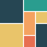
This layout is intended for a small number of items.
I didn't find, for the moment, a performant algorithm which would work in a Sliver context, that's why this is not a GridView and therefore there are no SliverStaggeredGrid.
Grid properties
- Evenly divided in n columns
- Small number of items
- Not scrollable
Tile properties
- Must occupy 1 to n columns
Placement algorithm
- Top-most and then left-most
Example
Below you'll find the code to create this grid layout:
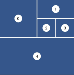
StaggeredGrid.count(
                  crossAxisCount: 4,
                  mainAxisSpacing: 4,
                  crossAxisSpacing: 4,
                  children: const [
                    StaggeredGridTile.count(
                      crossAxisCellCount: 2,
                      mainAxisCellCount: 2,
                      child: Tile(index: 0),
                    ),
                    StaggeredGridTile.count(
                      crossAxisCellCount: 2,
                      mainAxisCellCount: 1,
                      child: Tile(index: 1),
                    ),
                    StaggeredGridTile.count(
                      crossAxisCellCount: 1,
                      mainAxisCellCount: 1,
                      child: Tile(index: 2),
                    ),
                    StaggeredGridTile.count(
                      crossAxisCellCount: 1,
                      mainAxisCellCount: 1,
                      child: Tile(index: 3),
                    ),
                    StaggeredGridTile.count(
                      crossAxisCellCount: 4,
                      mainAxisCellCount: 2,
                      child: Tile(index: 4),
                    ),
                  ],
                );
Masonry

This layout facilitates the browsing of uncropped peer content. Container heights are sized based on the widget size.
This is a complete separate grid and not a SliverGridDelegate for performance reasons. The SliverGrid is great but it needs to have a layout which does not depends on the size of its children. Otherwise we have to compute the size to all children before the end of the cache, which is really not performant for a masonry layout.
Grid properties
- Evenly divided in n columns
Tile properties
- Must occupy 1 column only
Placement algorithm
- Top-most and then left-most
Example
Below you'll find the code to create this grid layout:
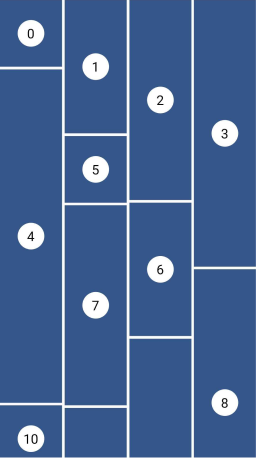
MasonryGridView.count(
                  crossAxisCount: 4,
                  mainAxisSpacing: 4,
                  crossAxisSpacing: 4,
                  itemBuilder: (context, index) {
                    return Tile(
                      index: index,
                      extent: (index % 5 + 1) * 100,
                    );
                  },
                );
Quilted
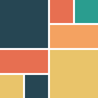
This layout emphasizes certain items over others in a collection. It creates hierarchy using varied container sizes and ratios.
This is a specific delegate for the built-in GridView (or SliverGrid) widget. That's why the example below will create such a layout with a GridView.
Grid properties
- Evenly divided in n columns
- The height of each row is equal to the width of each column
- A pattern defines the size of the tiles and different mode of repetition are possible
Tile properties
- Must occupy 1 to n columns
- Must occupy 1 or more entire rows
Placement algorithm
- Top-most and then left-most
Example
Below you'll find the code to create this grid layout:
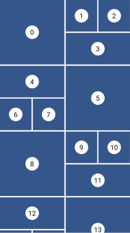
GridView.custom(
                  gridDelegate: SliverQuiltedGridDelegate(
                    crossAxisCount: 4,
                    mainAxisSpacing: 4,
                    crossAxisSpacing: 4,
                    repeatPattern: QuiltedGridRepeatPattern.inverted,
                    pattern: [
                      QuiltedGridTile(2, 2),
                      QuiltedGridTile(1, 1),
                      QuiltedGridTile(1, 1),
                      QuiltedGridTile(1, 2),
                    ],
                  ),
                  childrenDelegate: SliverChildBuilderDelegate(
                    (context, index) => Tile(index: index),
                  ),
                );
Woven

This layout facilitates the browsing of peer content. The items are displayed in containers of varying ratios to create a rhythmic layout.
This is a specific delegate for the built-in GridView (or SliverGrid) widget. That's why the example below will create such a layout with a GridView.
Grid properties
- Evenly divided in n columns
- The height the rows is the maximum height of the tiles
- A pattern defines the size of the tiles
- The size of the tiles follows the pattern in a 'z' sequence.
Tile properties
- The height is defined by an
aspectRatio(width/height) - The width is defined by a
crossAxisRatio(width/column's width) between 0 (exclusive) and 1 (inclusive) - Each tile can define how it is aligned within the available space
Placement algorithm
- Top-most and then left-most
Example
Below you'll find the code to create this grid layout:
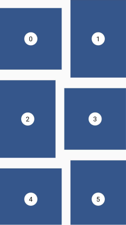
GridView.custom(
                  gridDelegate: SliverWovenGridDelegate.count(
                    crossAxisCount: 2,
                    mainAxisSpacing: 8,
                    crossAxisSpacing: 8,
                    pattern: [
                      WovenGridTile(1),
                      WovenGridTile(
                        5 / 7,
                        crossAxisRatio: 0.9,
                        alignment: AlignmentDirectional.centerEnd,
                      ),
                    ],
                  ),
                  childrenDelegate: SliverChildBuilderDelegate(
                    (context, index) => Tile(index: index),
                  ),
                );
Staired

This layout uses alternating container sizes and ratios to create a rhythmic effect. It's another kind of woven grid layout.
This is a specific delegate for the built-in GridView (or SliverGrid) widget. That's why the example below will create such a layout with a GridView.
Grid properties
- A pattern defines the size of the tiles
- Each tile is shifted from the previous one by a margin in both axis
- The placement follows a 'z' sequence
Tile properties
- The height is defined by an
aspectRatio(width/height) - The width is defined by a
crossAxisRatio(width/available horizontal space) between 0 (exclusive) and 1 (inclusive)
Placement algorithm
- In a 'z' sequence
Example
Below you'll find the code to create this grid layout:
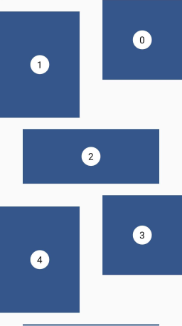
GridView.custom(
                  gridDelegate: SliverStairedGridDelegate(
                    crossAxisSpacing: 48,
                    mainAxisSpacing: 24,
                    startCrossAxisDirectionReversed: true,
                    pattern: [
                      StairedGridTile(0.5, 1),
                      StairedGridTile(0.5, 3 / 4),
                      StairedGridTile(1.0, 10 / 4),
                    ],
                  ),
                  childrenDelegate: SliverChildBuilderDelegate(
                    (context, index) => Tile(index: index),
                  ),
                );
Aligned
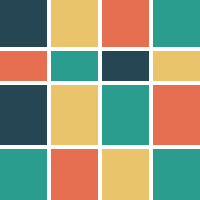
This layout is also called CSS Grid. This is a common grid layout on the web, where each item within a track has the maximum cross axis extent of its siblings.
Grid properties
- Evenly divided in n columns
- The rows can have differents heights
Tile properties
- Must occupy 1 column only
- Each tile has the same height as the tallest one of the row.
Placement algorithm
- Top-most and then left-most
Example
Below you'll find the code to create this grid layout:
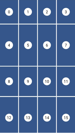
AlignedGridView.count(
                  crossAxisCount: 4,
                  mainAxisSpacing: 4,
                  crossAxisSpacing: 4,
                  itemBuilder: (context, index) {
                    return Tile(
                      index: index,
                      extent: (index % 7 + 1) * 30,
                    );
                  },
                );
Sponsoring
I'm working on my packages on my free-time, but I don't have as much time as I would. If this package or any other package I created is helping you, please consider to sponsor me so that I can take time to read the issues, fix bugs, merge pull requests and add features to these packages.
Sponsors
I want to thank Tommy for sponsoring this package. Thanks to him, I took the time to investigate in the previous performance issues and refactor this library to make it how is it today.
 Tom3652 |
Contributions
Feel free to contribute to this project.
If you find a bug or want a feature, but don't know how to fix/implement it, please fill an issue.
If you fixed a bug or implemented a feature, please send a pull request.
История изменений
0.7.0
Changed
- Bump minimal Flutter version to 3.7.0
Fixed
- Warning with Scrollable.of
0.6.2
Fixed
- Issue with Quilted layout algorithm. (https://github.com/letsar/flutter_staggered_grid_view/issues/232)
0.6.1
Fixed
- Issue when childCount is 0 with Quilted layout.
0.6.0
Added
- SliverAlignedGrid and AlignedGridView widgets.
Changed
- Renamed SliverMasonryGridDelegate to SliverSimpleGridDelegate.
0.5.1
Added
- StaggeredTile.fit constructor.
0.5.0
Changed
- Stable release
0.5.0-dev.8
Changed
- Make the
childCountparameter ofSliverMasonryGridconstructors, nullable and not required.
0.5.0-dev.7
Fixed
- Remove position issue with staired pattern.
0.5.0-dev.6
Fixed
- Remove extra space on fixed woven grid.
0.5.0-dev.5
Fixed
- Remove extra space on fixed quilted grid (#216).
0.5.0-dev.4
Fixed
- Issue with Woven pattern layout flow in second run.
0.5.0-dev.3
Fixed
- Issue with Woven pattern and text direction.
0.5.0-dev.2
Fixed
- Issue with Quilted pattern.
0.5.0-dev.1
Changed
- Complete rewriting of the package. It comes now with 5 differents grid layouts (Staggered, Masonry, Quilted, Woven, Staired).
0.4.1
Changed
- Add option to disable keepAlives
0.4.0
Changed
- Stable null safety version
0.4.0-nullsafety.3
Fixed
- LateInitializationError: Local
firstIndexhas not been initialized. (https://github.com/letsar/flutter_staggered_grid_view/issues/151)
0.4.0-nullsafety.2
Added
- Support for state restoration
0.4.0-nullsafety.1
Added
- Null Safety Support
0.3.4
Fixed
- KeepAliveBucket logic, should improve performances
0.3.3
Added
- Support for state restoration.
0.3.2
Fixed
- Flutter version dependency.
0.3.1
Fixed
- Static analysis issues.
0.3.0
Fixed
- Upgrade to AndroidX and fixes the BoxHitTestResult exception (https://github.com/letsar/flutter_staggered_grid_view/issues/49)
0.2.7
Fixed
- Better fix for the bug where items are built only once.
0.2.6
Fixed
- Fix a bug where items are built only once.
0.2.5
Changed
- Use the new SliverWithKeepAliveWidget.
0.2.4
Fixed
- Dart 2.1 mixin support.
0.2.3
Fixed
- Fix the rtl support (https://github.com/letsar/flutter_staggered_grid_view/issues/17).
0.2.2
- Add Dart 2 support.
0.2.1
- Fix #10
StatefulWidget.createState must return a subtype of State<AutomaticKeepAliveVariableSizeBox>.
0.2.0
- Add a way to let the tile's content to define the tile's extent in the main axis.
- Add
fitconstructor toStaggeredTile.
0.1.4
- Add
countBuilderandextendBuilderconstructors toSliverStaggeredGrid
0.1.3
- Remove Flutter SDK constraint
0.1.2
- Remove update Flutter SDK constraint
0.1.1
- Fix images in readme
- Add dynamic resizing demo
0.1.0
- Initial Open Source release