
geekyants_flutter_gauges
v1.0.4A linear gauge package for Flutter that displays progress and can be customized for appearance and behavior.
Архив пакета: https://pubdev.letsnova.ru/api/archives/geekyants_flutter_gauges/1.0.4.tar.gz
dart pub add geekyants_flutter_gaugesREADME
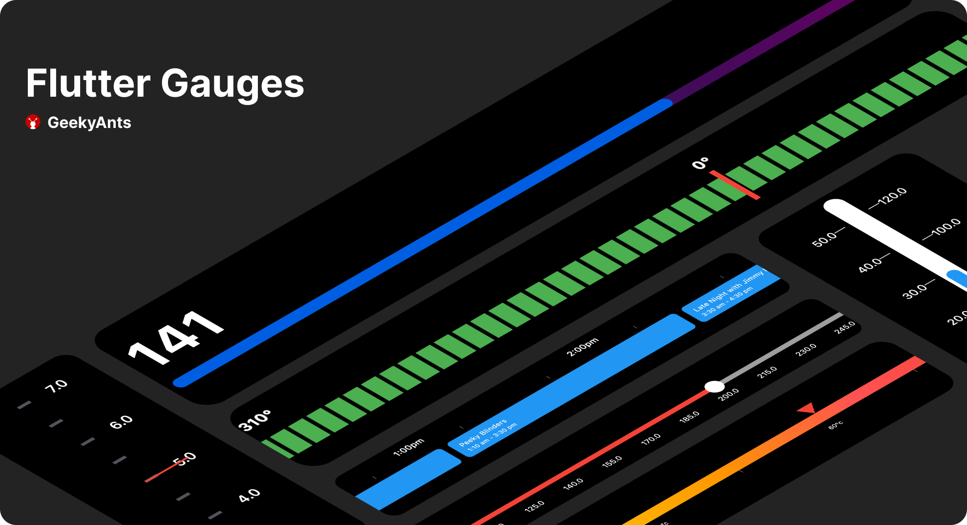
Gauges
A gauge, in science and engineering, is a device used to make measurements or in order to display certain dimensional information. A wide variety of tools exist which serve such functions, ranging from simple pieces of material against which sizes can be measured to complex pieces of machinery.Here in Flutter you can use this package to plot a machinery information effortlessly.




Demo Application
To fully explore the capabilities of our Linear Gauge, we recommend checking out our Demo Application which consists of Use Cases and Playgrounds for Linear Gauge DEMO APPLICATION
Table of contents
Getting started
Run this command
$flutter pub add geekyants_flutter_gauges
This will add a line like this to your package's pubspec.yaml (and run an implicit flutter pub get):
dependencies:
                  geekyants_flutter_gauges: 1.0.4
Usage
Import it inside your main.dart
import 'package:geekyants_flutter_gauges/geekyants_flutter_gauges.dart';
Use it as below
Linear Gauge usage
class _MyGaugeExampleState extends State<MyGaugeExample> {
                  @override
                  Widget build(BuildContext context) {
                    return Scaffold(
                      body: Center(
                        child: LinearGauge(
                          rulers: const RulerStyle(
                            rulerPosition: RulerPosition.bottom,
                          ),
                        ),
                      ),
                    );
                  }
                }
Radial Gauge usage
class _MyGaugeExampleState extends State<MyGaugeExample> {
                  @override
                  Widget build(BuildContext context) {
                    return Scaffold(
                      body: Center(
                        child: RadialGauge(
                        track: RadialTrack(
                          start: 0,
                          end: 100,
                        ),
                        needlePointer: [
                          NeedlePointer(
                            value: 30,
                            ),
                          ],
                        ),
                      )
                    );
                  }
                }
Linear Gauge
Gauge Orientation:
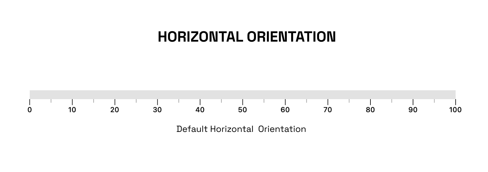
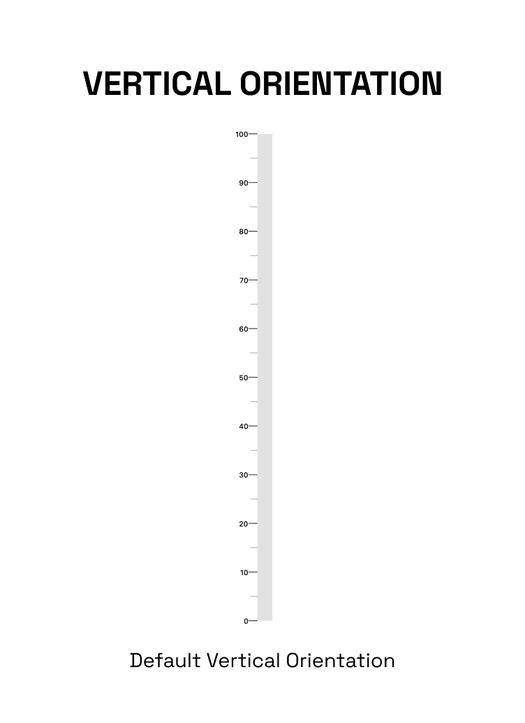
The linearGauge can be oriented vertically or horizontally. The orientation can be set using the Gaugeorientation property in the Linear Gauge. The possible values for the orientation property are:
GaugeOrientation.horizontal: The gauge will be oriented horizontally, with the minimum value on the left and the maximum value on the right.
GaugeOrientation.vertical: The gauge will be oriented vertically, with the minimum value at the bottom and the maximum value at the top.
RulerStyle:
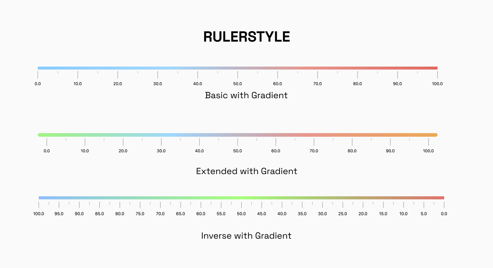
The RulerStyle class allows you to customize the appearance of the ruler used in the LinearGauge. With properties such as RulerPosition, showLabel, inverseRuler, and many more, you can customize the ruler in various ways to suit your needs.
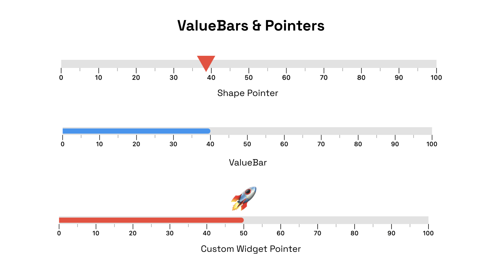
Pointer:
The Pointer is used to indicate a specific value on the gauge. The gauge can have multiple pointers with various shapes and values
ValueBar
The ValueBar in the LinearGauge is the component that displays the actual value of the gauge. It has properties such as color, offset, and thickness that can be customized to fit your needs.
There are different customization options available for pointers and value bar.
RangeLinearGauge
The RangeLinearGauge class enables you to customize the ruler appearance in the LinearGauge. You can display multiple ranges by providing a list of RangeLinearGauge values, and customize the color, start, and end values to match your requirements.


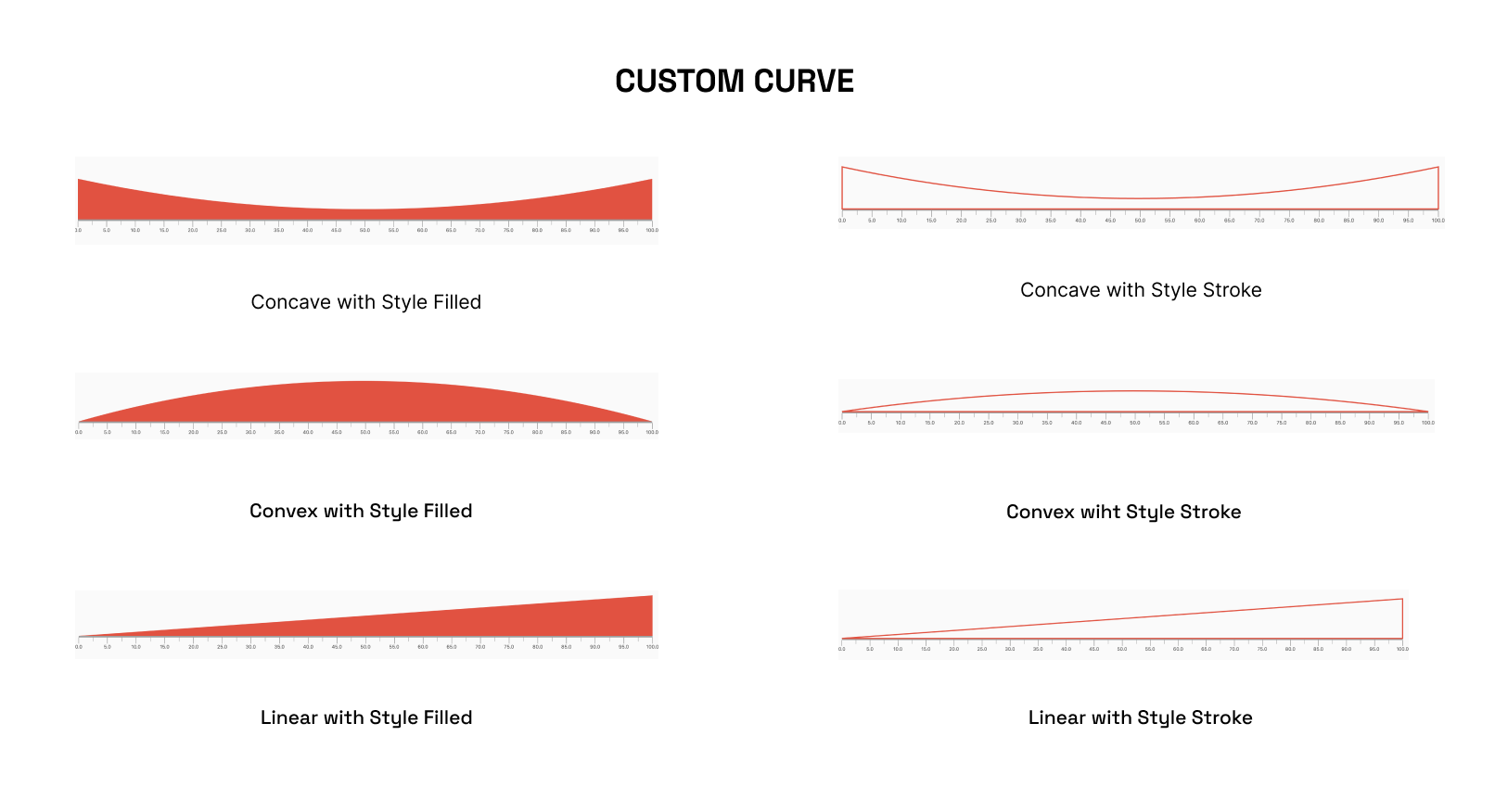
CustomCurve
The CustomCurve class allows you to draw Bezier and Straight curves on the LinearGauge, providing a high degree of customization for visualizing data.
Animations
The LinearGauge class includes pre-made animations that can be applied to its pointers, value bars, or the gauge's overall visibility. These animations can help to make the gauge more visually engaging and dynamic.

Interactivity
The Pointer is interactive , it responds to user horizontal & vertical drag.

Radial Gauge
A Radial Gauge is a graphical representation used to visualize and display a value within a circular format. It consists of several components, including a radial track, a needle pointer, and a value bar. The radial track represents the range or scale of values that the gauge can display, with the ability for users to set the start and end points of the track.
Position:
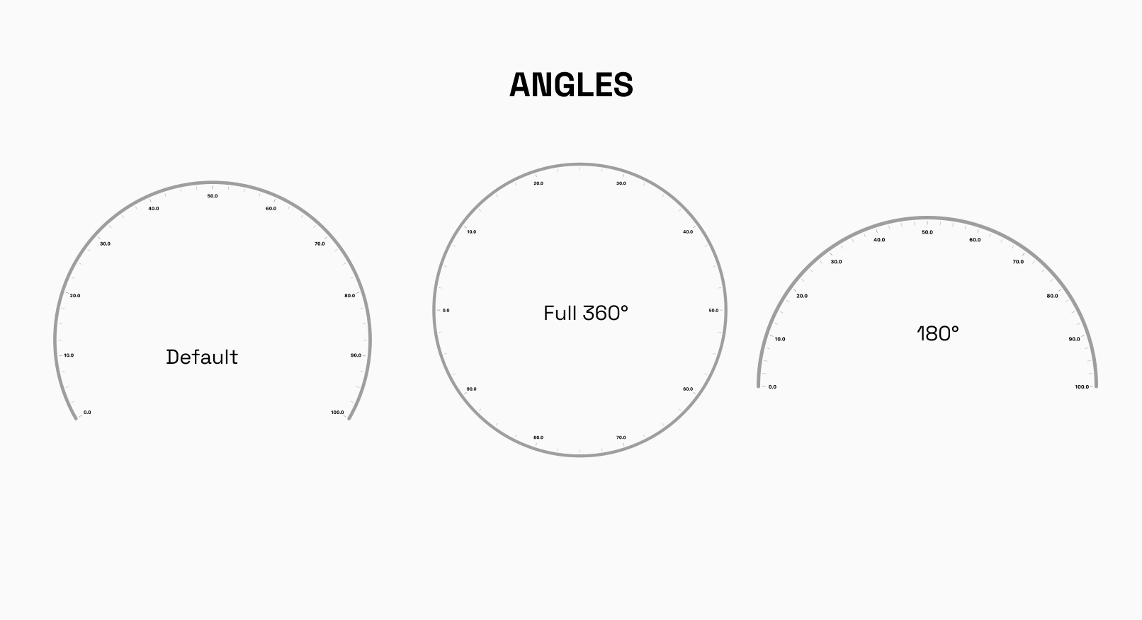
Angles
The RadialGauge can be easily laid out at different angles around its center. You have the freedom to specify the starting and ending angles, defining the arc over which the gauge will be displayed. This feature is particularly useful when you want to display multiple gauges side by side or need to emphasize a specific range on the gauge.
Default startAngle : -30°
Default endAngle`: 210°
Custom Track Labels
The labels displayed on the RadialGauge track can easily be formated to your need.

Radii Customization
radiusFactor can be used to size the adjust the scaling factor of the radius and change the radius of the gauge accordingly.
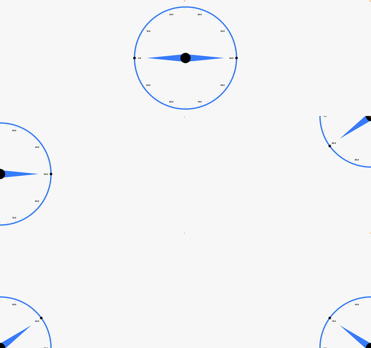
X and Y Coordinates
To precisely position the RadialGauge on your canvas or user interface, you can set the x and y coordinates of its center. This way, you can easily integrate the gauge into your existing layout or place it at specific locations as per your application's design requirements.
By combining these layout options, you can create stunning and interactive radial gauges that effectively present data to your users, whether it's for monitoring, analytics, or any other visualization needs.
Default xCoordinate : 0.5
Default yCoordinate`: 0.5
Needle Pointer
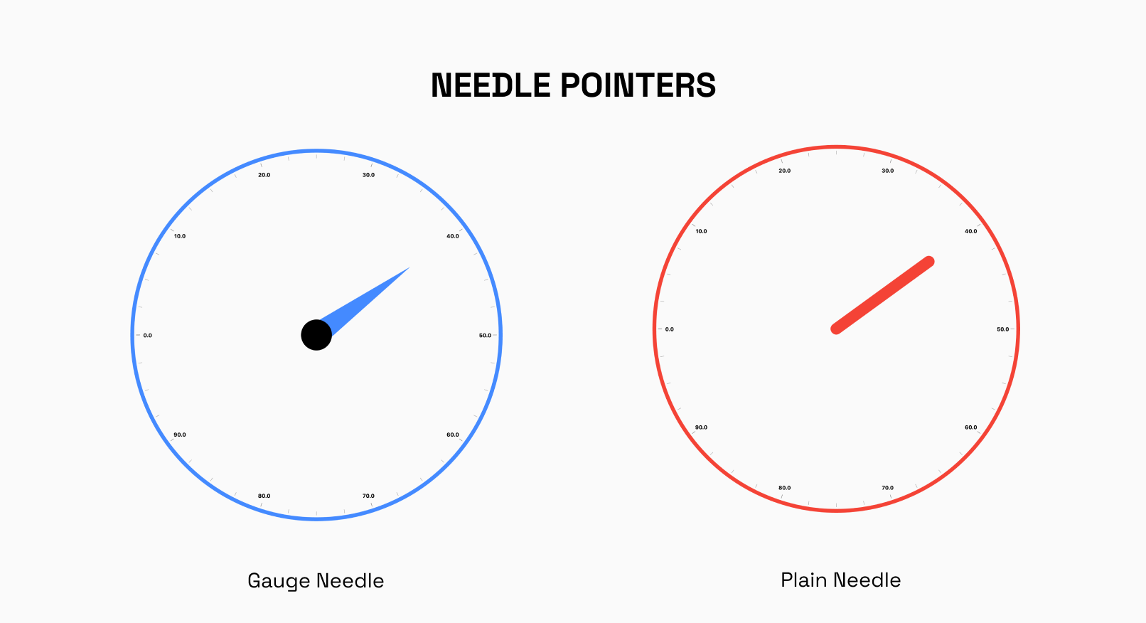
The NeedlePointer is a powerful component that enables you to create and customize Needle Pointers for your gauges. With this widget, you have the flexibility to design multiple Needle Pointers and adjust their styles using the gaugeNeedle and plainneedle enums.
Shape Pointer
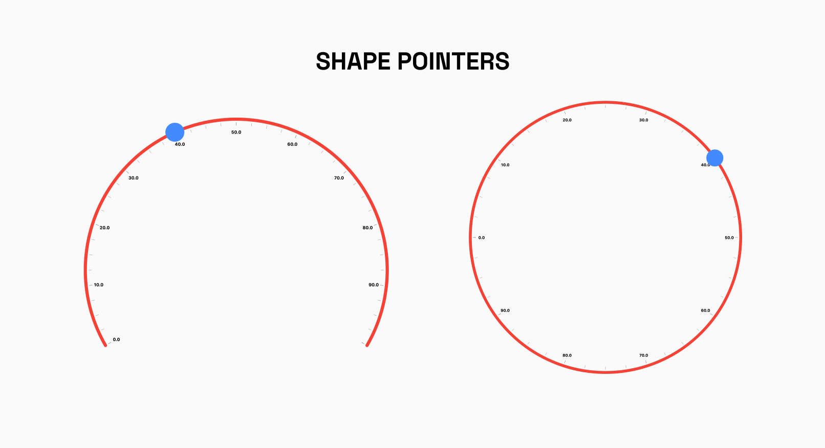
The RadialShapePointer allows you to add Shape Pointer to your Gauge.The shape can be customized using properties such as color, width and height.
Currently, Only Circle Shape is supported
Radial Value Bar
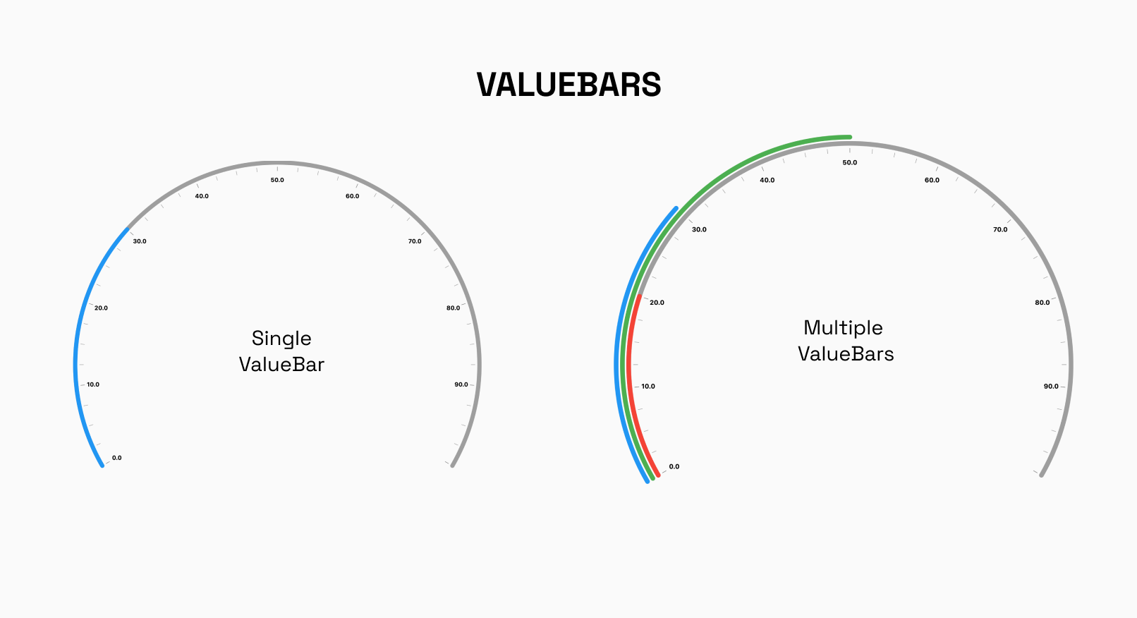
The RadialValueBar is a crucial component used within the RadialGauge to visually represent a specific value on the gauge using a bar. This bar provides users with a clear and intuitive indication of the current value within the defined range of the radial track.
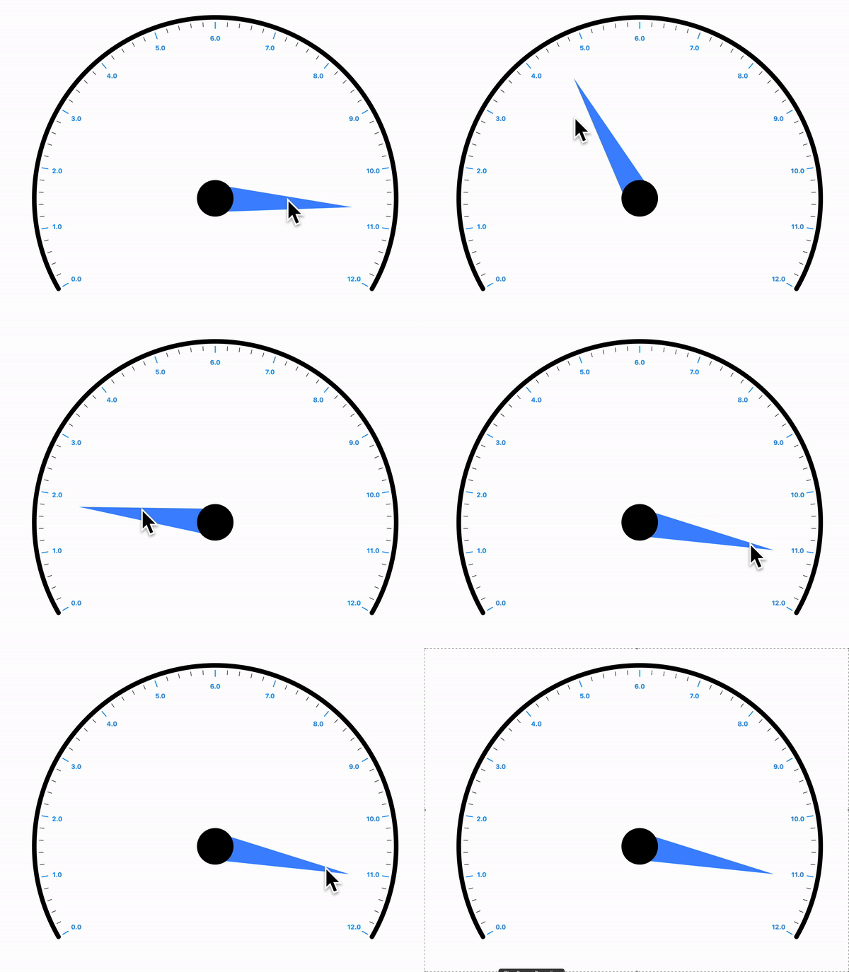
Interactivity Radial
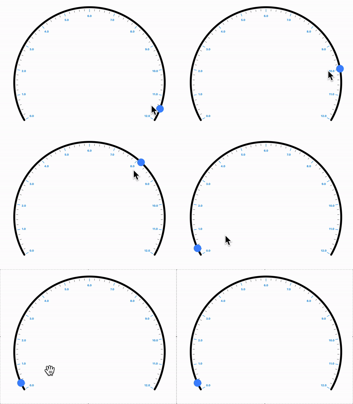
In the Radial Gauge, the NeedlePointer and RadialShapePointer can be set to interactive, making them respond to user's horizontal and vertical drag.
License
MIT License , Copyright © 2023 GeekyAnts. See LICENSE for more information.
Contributors
Credits
Made with ❤️ by

История изменений
1.0.4
Features
- Add Custom Track Labels to Radial Gauge
Fixes
- Fixed needle-gap issue in Radial Gauge
1.0.3
Fixes
- Fixed Drawing of
PointerovervalueBar
1.0.2
Features
- Support for Multiple Needle Pointers
- Support for Multiple Shape Pointers
- Interactivity for Needle Pointers in
RadialGauge - Interactivity for Shape Pointers in
RadialGauge
Fixes
- More control over positioning
RadialGauge - Refactored
RadialGauge - More control over styling of
NeedlePointer
1.0.1
Fixes
- Re Architechtured
LinearGauge - Support for
PointerInteractivity - Support for Widget Pointers
- Each element is now converted as
RenderObject
Features
- Support for
RadialGauge[Pre-Release]
1.0.0+5
Fixes
- Updated Readme and docs
1.0.0+4
Fixes
- Support for Labels on
Pointers
Feature
- Support for
Animations(Gauge Animations along with Pointer & ValueBar animations) - Support for
CustomCurve
1.0.0+3
Updated Example
1.0.0+2
Minor fixes for analyzer
1.0.0+1
Minor fixes
1.0.0
- Support for Vertical Orientation
- Support for
RulerPosition - Support for
Custom Labels - Support for Inverse Rulers
- Support for Extended LinearGauge
- Support for multiple
ValueBars - Support for ValueBar position
- Support for ValueBar Thickness
- Support for multiple
Pointers - Support for
Pointer Alignment - Support for
Pointer Position - Support for
RangeLinearGauge
0.0.6+1
- property change from
colortobackgroundColorinLinearGaugeBoxDecoration
0.0.6
- Added bool param showLabel which controls the visibility of labels (Default is true)
- Added TextStyle param textStyle which will style the label text
- Added bool param showPrimaryRulers which will control the visibility of primary rulers (Default is true)
- Added bool param showSecondaryRulers which control the visibility of secondary rules (Default is true)
0.0.5
- Initial Release