
group_button
v5.3.4Flutter custom widget to make a group buttons. Included Radio and CheckBox buttons.
Архив пакета: https://pubdev.letsnova.ru/api/archives/group_button/5.3.4.tar.gz
dart pub add group_buttonREADME
Flutter widget to create a group of buttons fast 🚀
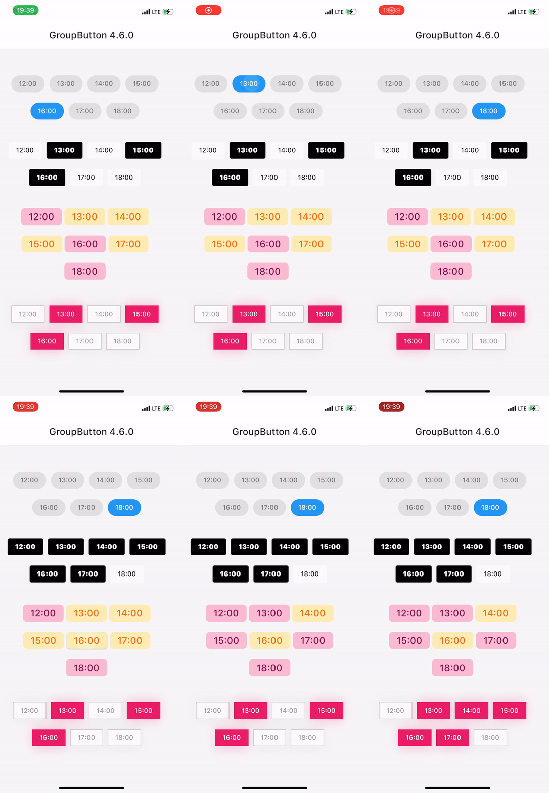
Included Radio and CheckBox buttons models with custom groping types 🤤
Show some ❤️ and star the repo to support the project!




 |
 |
 |
|---|
| GroupButtonController | GroupButtonBuilder | GroupButtonOptions |
|---|
Getting Started
Follow these steps to use this package
Add dependency
dependencies:
                  group_button: ^5.3.4
Add import package
import 'package:group_button/group_button.dart';
Easy to use
Simple example of use GroupButton
Put this code in your project at an screen and learn how it works 😊
GroupButton(
                    isRadio: false,
                    onSelected: (index, isSelected) => print('$index button is selected'),
                    buttons: ["12:00", "13:00", "14:30", "18:00", "19:00", "21:40"],
                )
Controller
Starting from version 4.1.0
You can control your Group Button using the controller
final controller = GroupButtonController();

                Column(
                  children: [
                    GroupButton.checkbox(
                      controller: controller,
                      buttons: ['12:00', '13:00', '14:00'],
                      onSelected: (i, selected) => debugPrint('Button #$i $selected'),
                    ),
                    TextButton(
                      onPressed: () => controller.selectIndex(1),
                      child: const Text('Select 1 button'),
                    )
                  ],
                ),
Generic button value
In new 5.0.0 version you can set custom buttons value type
It can be int, DateTime, double or YourCustomClass
Button text will be result of .toString() model method in common button display case
GroupButton<DateTime>(
                  buttons: [DateTime(2022, 4, 9), DateTime(2022, 4, 10)],
                )
Button builders
Also you can use generic button values with cutsom buttonBuilder
In order to turn values into any widget
GroupButton<DateTime>(
                  buttons: [DateTime(2022, 4, 9), DateTime(2022, 4, 10)],
                  buttonBuilder: (selected, date, context) {
                    return Text('${date.year}-${date.month}-${date.day}');
                  },
                ),
In this package, there are four different possibilities for customizing your buttons through builders
- 1 buttonBuilder It will build a fully custom button based on the value parameter
- 2 buttonIndexedBuilder same as buttonBuilder. But based on button index.
- 3 buttonTextBuilder It will replace the text of your button, which is constructed based on the style parameters passed in GroupButtonOptions. The appearance of the button remains the same, but the text is changed. Based on button value.
- 4 buttonIndexedTextBuilder same as buttonTextBuilder. But based on button index.
Fully Customize
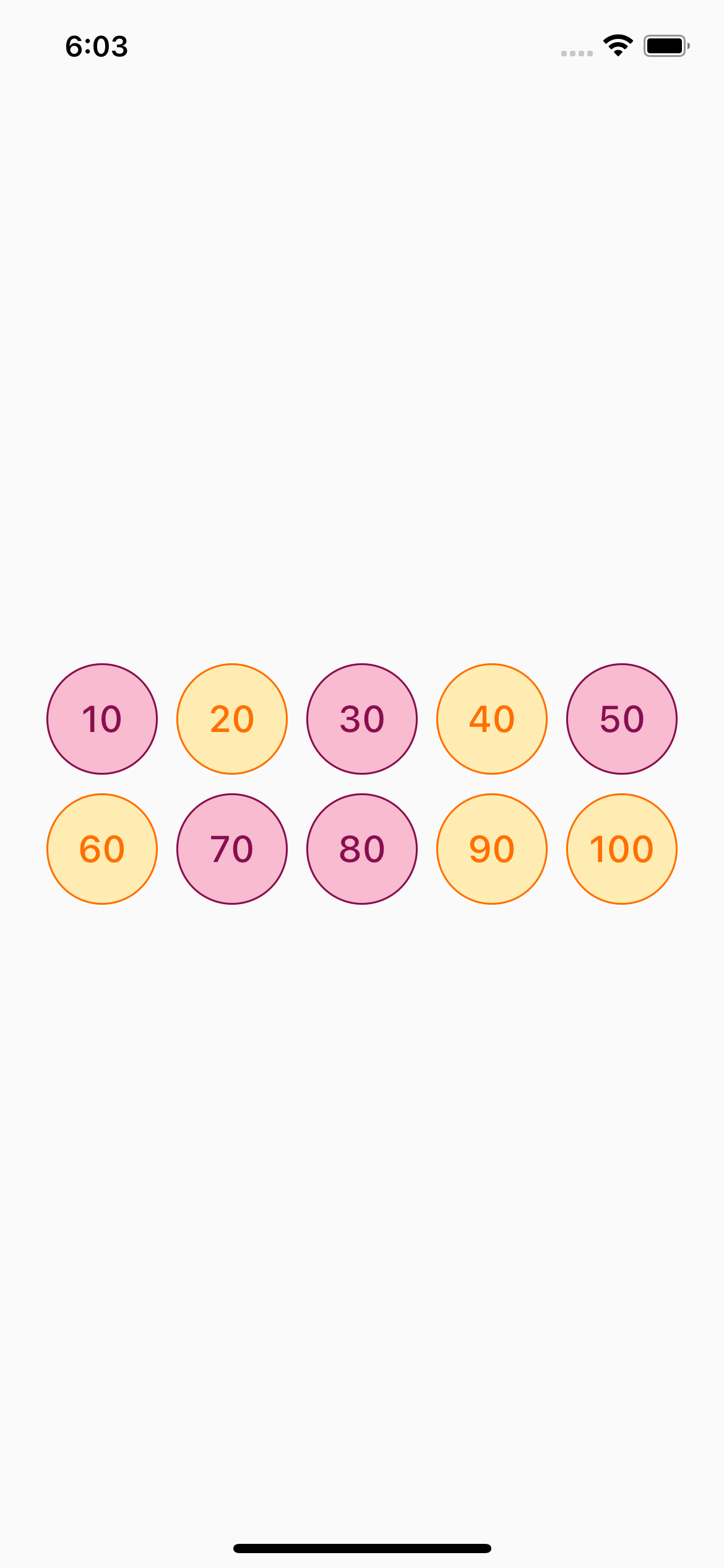
In order to customize your buttons inside GroupButton you can use GroupButtonOptions
GroupButtonOptions(
                  selectedShadow: const [],
                  selectedTextStyle: TextStyle(
                    fontSize: 20,
                    color: Colors.pink[900],
                  ),
                  selectedColor: Colors.pink[100],
                  unselectedShadow: const [],
                  unselectedColor: Colors.amber[100],
                  unselectedTextStyle: TextStyle(
                    fontSize: 20,
                    color: Colors.amber[900],
                  ),
                  selectedBorderColor: Colors.pink[900],
                  unselectedBorderColor: Colors.amber[900],
                  borderRadius: BorderRadius.circular(100),
                  spacing: 10,
                  runSpacing: 10,
                  groupingType: GroupingType.wrap,
                  direction: Axis.horizontal,
                  buttonHeight: 60,
                  buttonWidth: 60,
                  mainGroupAlignment: MainGroupAlignment.start,
                  crossGroupAlignment: CrossGroupAlignment.start,
                  groupRunAlignment: GroupRunAlignment.start,
                  textAlign: TextAlign.center,
                  textPadding: EdgeInsets.zero,
                  alignment: Alignment.center,
                  elevation: 0,
                ),
Examples
You can check more examples of using this package here
Thanks to all contributors of this package
For help getting started with 😍 Flutter, view online documentation, which offers tutorials, samples, guidance on mobile development, and a full API reference.
История изменений
5.3.4
- Fix deprecated member 'primary'
Thanks to NeroThroN
5.3.3
- Remove self linter with flutter_lints
- Fix linter issues
- Format files
5.3.2
- Update sdk version to '>=2.15.0 <4.0.0'
5.3.1
- Add topics in pubspec.yaml
- Remove deprecated linter rules
5.3.0
- Implement buttonIndexedTextBuilder and buttonTextBuilder for building only text of buttons. See more in docs
- Recreate example host folders
5.2.2
- INFO Update README badages
5.2.1
- INFO Compatibility with flutter version under 3.3.0
5.2.0
- INFO: Make the package compatible with the 3.3.0 Flutter version
- FIX: Analyser issues
5.1.0
- BREAKING: idnex -> index change typo fix for onDisablePressed callback Function of GroupButtonController
- INFO: Examples and code base refactoring
Thanks for anasfik
5.0.1
- FEAT: Added user friendly example
Thanks for vasilich6107
5.0.0
-
MAIN FEAT: GroupButton<T> now is generic class.
Now you can create int, DateTime, double or YourCustomClass typed buttons List for default GroupButton constructor.
More here -
BREAKING: All deprecated by 4.3.0 and 4.6.0 fields was removed from package.
More here -
BREAKING: buttonBuilder from 4.6.0 now build buttons by value
The buttonIndexedBuilder took over the past functionality of the buttonBuilder -
INFO: Updated examples & README
4.8.0
- FEAT: Added enableIndexes abd disableIndexes methods for controller
Thanks for minhdanh
4.7.0
- FEAT: Added maxSelected field for setting max selected buttons in checkbox mode
Thanks for gnassro
4.6.0
- FEAT: Added buttonBuilder field for implementing your own custom buttons
- FEAT: Added ButtonBuilderExample with Flutter default radio and chackbox buttons via buttonBuilder
- INFO: Updated examples & README
4.5.0
- FEAT: enableDeselect field for enable radio button deselect
4.4.0
- BREAKING: remove GroupButton.checkbox() and GroupButton.radio() constructors from 4.0.0 updates
4.3.0
- FEAT: Implment GroupButtonOptions model to pass all styles of widget via one field
- DEPRECATED: All styles fields in default GroupButton constructor now deprecated.
In new version of package send it via GroupButtonOptions
List of fields:
- groupingType
- direction
- spacing
- runSpacing
- selectedTextStyle
- unselectedTextStyle
- selectedColor
- unselectedColor
- selectedBorderColor
- unselectedBorderColor
- borderRadius
- selectedShadow
- unselectedShadow
- buttonHeight
- buttonWidth
- mainGroupAlignment
- crossGroupAlignment
- groupRunAlignment
- textAlign
- textPadding
- alignment
- elevation
4.2.1
- FIX: deprecated fields
4.2.0
- FEAT: Add disabled buttons to controller
- FEAT: Add controller fields initialization in controller constructor
- INFO: Add deprecatd annotation for selectedButton, selectedButtons and disabledButtons
4.1.1
- FIX: GroupbuttonController initialization
4.1.0
- FEAT: onDisablePressed calback method for handle taps on disabled buttons
4.0.0
- FEAT: GroupButtonController for working with GroupButton from the outside
- FEAT: New GroupButton factory constructors GroupButton.checkbox and GroupButton.checkbox for faster buttons group creation
- FIX: Common issues
3.3.1
- FIX: fix static analysis issues
3.3.0
- FEAT: Add alignment field
- FEAT: Add elevation field
- FEAT: Add disabledButtons field
Thanks for slavap
3.2.0
- FEAT: Add textAlign field
- FEAT: Add textPadding field
3.1.0
- FEAT: Add runSpacing field ! When [groupingType] is [GroupingType.wrap] this field sets Wrap [runSpacing]
- BREAKING: Now spacing field is not sets GroupButton items vertical spacing
3.0.1
- FIX: Remove initial selected button from original widget initialization
3.0.0+1
- FIX: fix app logo link
3.0.0
- BREAKING: Implement groupingType field to make different grouping types like Wrap, Column, Row
- FEAT: Remove default values of styling fields for delegate this to theme
- refactoring: Make some internal refactoring
2.4.1
- FIX: fix static analysis issues
2.4.0
- FEAT: implement
runGroupAlignmentfield for placed buttons runs themselves along the cross axis in a layout.
2.3.0
- FEAT: implement
mainGroupAlignmentfield for placed buttons in the main axis in a layout. - FEAT: implement
crossGroupAlignmentfield for placed buttons along the cross axis in a layout.
2.2.2 - 2021-06-05
- Create example with using provider as state-manager
2.2.1 - 2021-06-01
- Update examples in README.md
2.2.0 - 2021-06-01
- Remove provider dependency
- Fix fields passing for widget
- Update selectedButtons field (Now int like index)
- Add selectedButton field for radio type
2.1.2 - 2021-05-04
- Fix selectedBorderColor not working exception
2.1.1 - 2021-05-04
- Fix spacing error issue
2.1.0 - 2021-04-06
- Add ability for using radio mode without an selected buttons
2.0.0+1 - 2021-04-06
- Fix static analysis issues
2.0.0 - 2021-04-06
- Migrate to null-safety commit
1.3.0 - 2021-03-04
- Migrate from using RaisedButton to ElevatedButton
1.2.0 - 2021-03-03
- Add width and height fields for buttons
1.1.1 - 2021-02-20
- Refactor code
- Add lint package
1.1.0 - 2020-10-19
- Added ability to set initially selected buttons
1.0.2 - 2020-08-11
- Create travis & codemagic QA
1.0.1 - 2020-08-11
- Fix dart analyzer issues, errors and remarks
1.0.0 - 2020-08-11
- Basic functionality for creating a button group
- Two models of the group were created:
- Radio (one selected button)
- CheckBox (several selected buttons)
0.1.0 - 2020-08-9
- Initial package skeleton