
table_calendar
v3.2.1Highly customizable, feature-packed calendar widget for Flutter.
Package archive: https://pubdev.letsnova.ru/api/archives/table_calendar/3.2.1.tar.gz
dart pub add table_calendarReadme
TableCalendar


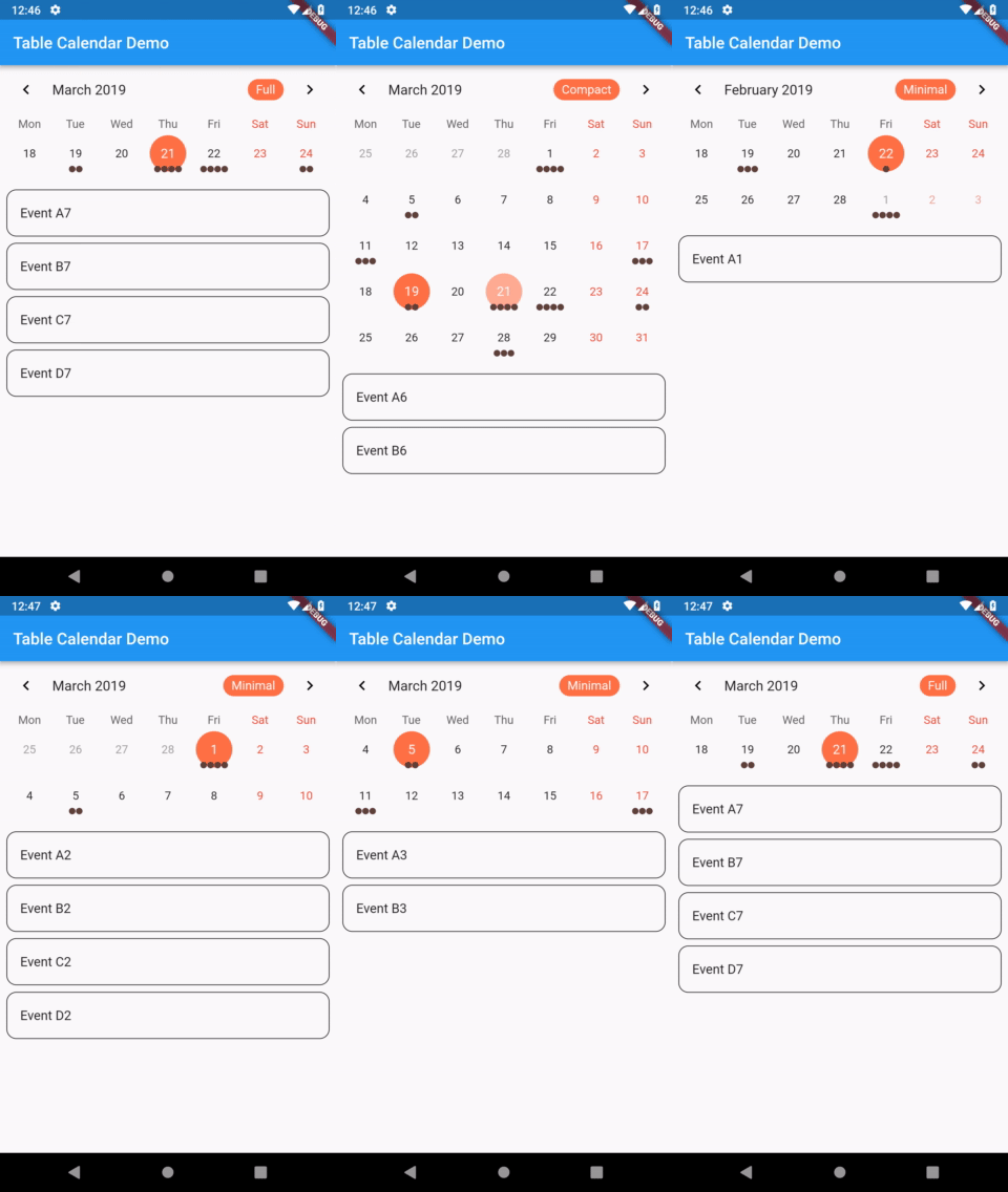
Highly customizable, feature-packed calendar widget for Flutter.
 |
 |
|---|---|
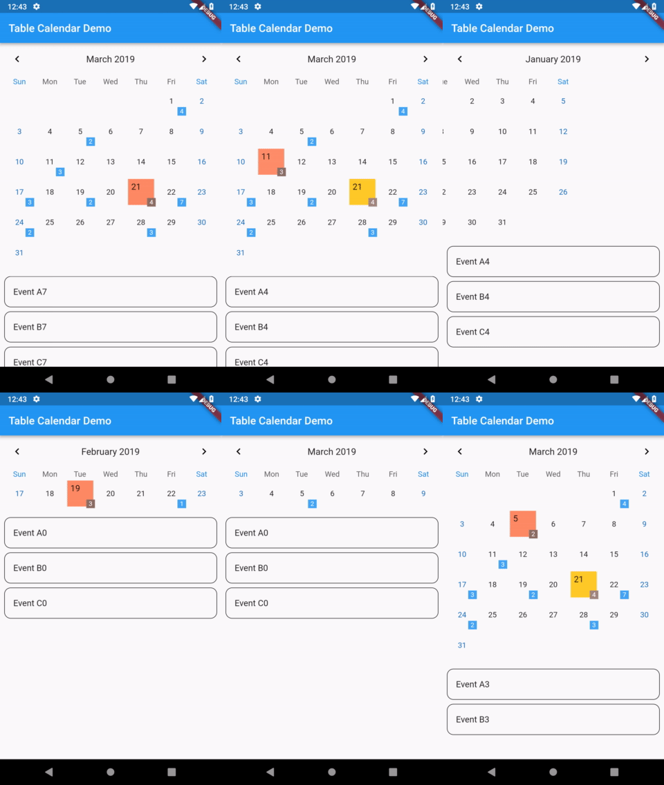
| TableCalendar with custom styles | TableCalendar with custom builders |
Features
- Extensive, yet easy to use API
- Preconfigured UI with customizable styling
- Custom selective builders for unlimited UI design
- Locale support
- Range selection support
- Multiple selection support
- Dynamic events and holidays
- Vertical autosizing - fit the content, or fill the viewport
- Multiple calendar formats (month, two weeks, week)
- Horizontal swipe boundaries (first day, last day)
Usage
Make sure to check out examples and API docs for more details.
Installation
Add the following line to pubspec.yaml:
dependencies:
                  table_calendar: ^3.2.1
Basic setup
The complete example is available here.
TableCalendar requires you to provide firstDay, lastDay and focusedDay:
firstDayis the first available day for the calendar. Users will not be able to access days before it.lastDayis the last available day for the calendar. Users will not be able to access days after it.focusedDayis the currently targeted day. Use this property to determine which month should be currently visible.
TableCalendar(
                  firstDay: DateTime.utc(2010, 10, 16),
                  lastDay: DateTime.utc(2030, 3, 14),
                  focusedDay: DateTime.now(),
                );
Adding interactivity
You will surely notice that previously set up calendar widget isn't quite interactive - you can only swipe it horizontally, to change the currently visible month. While it may be sufficient in certain situations, you can easily bring it to life by specifying a couple of callbacks.
Adding the following code to the calendar widget will allow it to respond to user's taps, marking the tapped day as selected:
selectedDayPredicate: (day) {
                  return isSameDay(_selectedDay, day);
                },
                onDaySelected: (selectedDay, focusedDay) {
                  setState(() {
                    _selectedDay = selectedDay;
                    _focusedDay = focusedDay; // update `_focusedDay` here as well
                  });
                },
In order to dynamically update visible calendar format, add those lines to the widget:
calendarFormat: _calendarFormat,
                onFormatChanged: (format) {
                  setState(() {
                    _calendarFormat = format;
                  });
                },
Those two changes will make the calendar interactive and responsive to user's input.
Updating focusedDay
Setting focusedDay to a static value means that whenever TableCalendar widget rebuilds, it will use that specific focusedDay. You can quickly test it by using hot reload: set focusedDay to DateTime.now(), swipe to next month and trigger a hot reload - the calendar will "reset" to its initial state. To prevent this from happening, you should store and update focusedDay whenever any callback exposes it.
Add this one callback to complete the basic setup:
onPageChanged: (focusedDay) {
                  _focusedDay = focusedDay;
                },
It is worth noting that you don't need to call setState() inside onPageChanged() callback. You should just update the stored value, so that if the widget gets rebuilt later on, it will use the proper focusedDay.
The complete example is available here. You can find other examples here.
Events
The complete example is available here.
You can supply custom events to TableCalendar widget. To do so, use eventLoader property - you will be given a DateTime object, to which you need to assign a list of events.
eventLoader: (day) {
                  return _getEventsForDay(day);
                },
_getEventsForDay() can be of any implementation. For example, a Map<DateTime, List<T>> can be used:
List<Event> _getEventsForDay(DateTime day) {
                  return events[day] ?? [];
                }
One thing worth remembering is that DateTime objects consist of both date and time parts. In many cases this time part is redundant for calendar related aspects.
If you decide to use a Map, I suggest making it a LinkedHashMap - this will allow you to override equality comparison for two DateTime objects, comparing them just by their date parts:
final events = LinkedHashMap(
                  equals: isSameDay,
                  hashCode: getHashCode,
                )..addAll(eventSource);
Cyclic events
eventLoader allows you to easily add events that repeat in a pattern. For example, this will add an event to every Monday:
eventLoader: (day) {
                  if (day.weekday == DateTime.monday) {
                    return [Event('Cyclic event')];
                  }

                  return [];
                },
Events selected on tap
Often times having a sublist of events that are selected by tapping on a day is desired. You can achieve that by using the same method you provided to eventLoader inside of onDaySelected callback:
void _onDaySelected(DateTime selectedDay, DateTime focusedDay) {
                  if (!isSameDay(_selectedDay, selectedDay)) {
                    setState(() {
                      _focusedDay = focusedDay;
                      _selectedDay = selectedDay;
                      _selectedEvents = _getEventsForDay(selectedDay);
                    });
                  }
                }
The complete example is available here.
Custom UI with CalendarBuilders
To customize the UI with your own widgets, use CalendarBuilders. Each builder can be used to selectively override the UI, allowing you to implement highly specific designs with minimal hassle.
You can return null from any builder to use the default style. For example, the following snippet will override only the Sunday's day of the week label (Sun), leaving other dow labels unchanged:
calendarBuilders: CalendarBuilders(
                  dowBuilder: (context, day) {
                    if (day.weekday == DateTime.sunday) {
                      final text = DateFormat.E().format(day);

                      return Center(
                        child: Text(
                          text,
                          style: TextStyle(color: Colors.red),
                        ),
                      );
                    }
                  },
                ),
Locale
To display the calendar in desired language, use locale property.
If you don't specify it, a default locale will be used.
Initialization
Before you can use a locale, you might need to initialize date formatting.
A simple way of doing it is as follows:
- First of all, add intl package to your pubspec.yaml file
- Then make modifications to your
main():
import 'package:intl/date_symbol_data_local.dart';

                void main() {
                  initializeDateFormatting().then((_) => runApp(MyApp()));
                }
After those two steps your app should be ready to use TableCalendar with different languages.
Specifying a language
To specify a language, simply pass it as a String code to locale property.
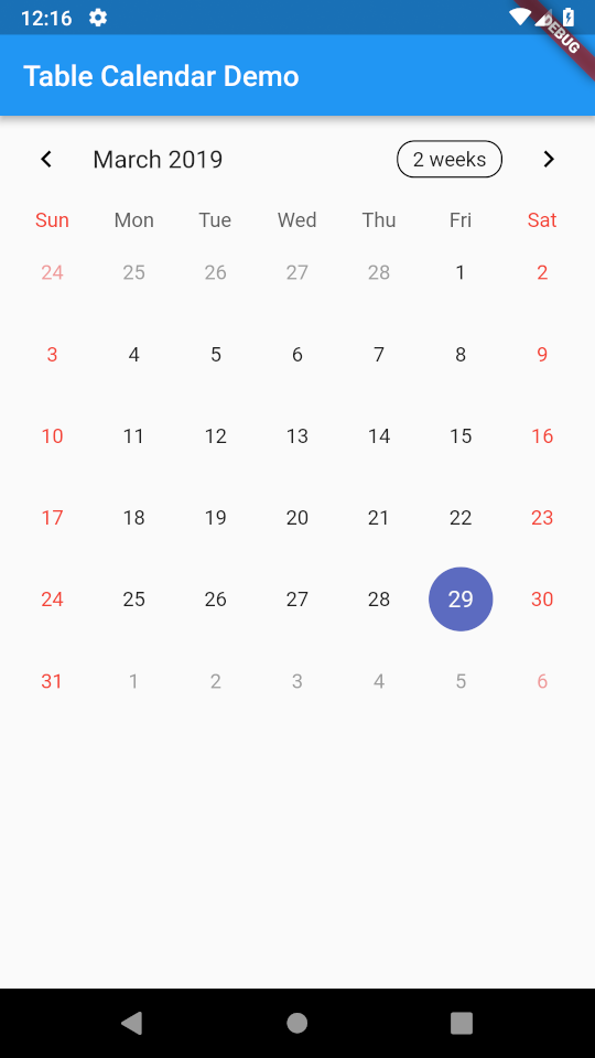
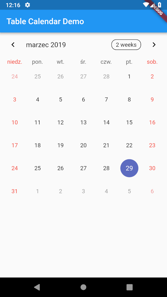
For example, this will make TableCalendar use Polish language:
TableCalendar(
                  locale: 'pl_PL',
                ),
 |
 |
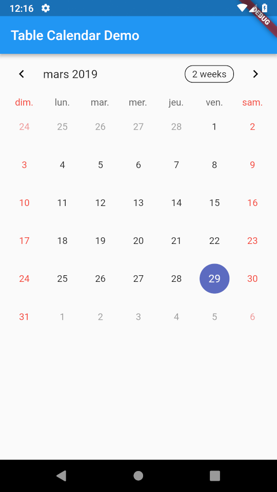 |
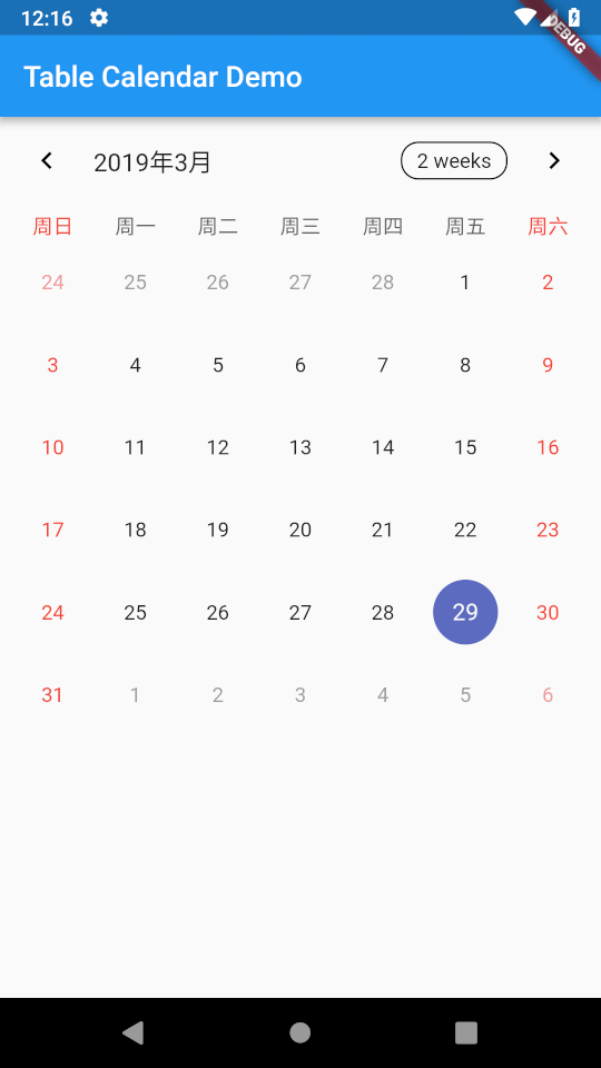 |
|---|---|---|---|
'en_US' |
'pl_PL' |
'fr_FR' |
'zh_CN' |
Note, that if you want to change the language of FormatButton's text, you have to do this yourself. Use availableCalendarFormats property and pass the translated Strings there. Use i18n method of your choice.
You can also hide the button altogether by setting formatButtonVisible to false.
Changelog
[3.2.1]
- Upgraded Android and iOS build config for the example project
- Adjusted header layout in complex_example
[3.2.0]
- Added loadEventsForDisabledDays property to enable loading events for disabled days as well
- Fixed empty weekendDays assertion issue
- Updated intl version to 0.20.0
[3.1.3]
- Updated gradle config for example project
- Added and applied lint rules, refactored code
[3.1.2]
- Added dayTextFormatter property to CalendarStyle that allows to customize the text within day cells
- Reverted the default day cell's text formatting to just the day's number
[3.1.1]
- Added cell text localization based on current locale
[3.1.0]
- Upgraded to Dart 3
- Updated intl version to 0.19.0
[3.0.9]
- Updated intl version to 0.18.0
- Added explicit android:exported value to AndroidManifest
[3.0.8]
- Added tablePadding property to CalendarStyle
[3.0.7]
- Added week numbering feature
[3.0.6]
- Fixed issue with missing Flutter Web platform tag
[3.0.5]
- Added a visual indicator to FormatButton
- Header buttons are now platform-aware
[3.0.4]
- Updated dependencies
- Removed deprecated fields
[3.0.3]
- Added semantic label to prioritizedBuilder
- Added tableBorder property to CalendarStyle
- Added cellAlignment property to CalendarStyle
- Added cellPadding property to CalendarStyle
[3.0.2]
- Improved semantic labels for screen readers
[3.0.1]
- Added pageAnimationEnabled property
- Added currentDay property to improve widget testability
[3.0.0]
- Migrated to null safety
- Removed CalendarController
- Improved horizontal scrolling
- Improved widget performance
- Improved documentation
- Added date range selection
- Added multiple date selection
- Added selective CalendarBuilders
- Added firstDay and lastDay scroll boundaries
- Added shouldFillViewport property
- Added sixWeekMonthsEnforced property
- Added more options to customize calendar's behavior
[2.3.3]
- Updated dependencies
[2.3.2]
- Added previousPage and nextPage methods to CalendarController
[2.3.1]
- Added chevron visibility properties to HeaderStyle
- Added cellMargin property to CalendarStyle
- Added eventDayStyle property to CalendarStyle
- Added availableCalendarFormats dynamic update
- Added optional BoxDecoration for each calendar row
- Added optional BoxDecoration for days of week row
[2.3.0]
- Migrated to AndroidX
- Added holidays to onDaySelected callback
- Replaced deprecated overflow property with clipBehavior
[2.2.3]
- Added onCalendarCreated callback
[2.2.2]
- Added highlightSelected property to CalendarStyle
- Added highlightToday property to CalendarStyle
[2.2.1]
- Added onHeaderTapped callback
- Added onHeaderLongPressed callback
- Fixed endDay issue
[2.2.0]
- Added LongPress Gesture support
- Added option to disable days based on a predicate
- Added option to hide DaysOfWeek row
- Added header Decoration
- Added headerMargin property
- Added headerPadding property
- Added contentPadding property
[2.1.0]
- Added dynamic events and holidays
- Added StartingDayOfWeek for every weekday
- Added support for custom weekend days
- Added dowWeekdayBuilder and dowWeekendBuilder
- Broadened intl dependency bounds
- markersMaxAmount no longer affects markersBuilder
- Fixed twoWeeks format programmatic issue
- Fixed visibleDays issue
- Fixed null dispose issue
[2.0.2]
- Updated dependencies
[2.0.1]
- Fixed issue with custom markers for holidays
[2.0.0]
- Added CalendarController - TableCalendar now features complete programmatic control
- Removed redundant properties
- Updated example project
- Updated README
[1.2.5]
- Fixed last day of month animation issue
[1.2.4]
- Improved DateTime logic
- Event markers can now be set to overflow cell boundaries
[1.2.3]
- Added startDay and endDay to allow users to specify available date range
- Added unavailableStyle and unavailableDayBuilder for days outside of given date range
- Added onUnavailableDaySelected callback
- Unavailable days will not display event markers
[1.2.2]
- Fixed issue with Markers being null
[1.2.1]
- RowHeight can now be set as a fixed value
- MaxMarkersAmount will now affect MarkersBuilder
[1.2.0]
- Added holiday support
- Added holiday usage guide
- Improved custom markers builder
- Added rendering priority customization
- Added FormatButton behavior customization
[1.1.4]
- Added TextBuilders for Header and DOW panel
- Improved vertical swipe behavior
[1.1.3]
- Added title text customization with format skeleton
- Added day of the week text customization with format skeleton
- Rolled-back intl dependency
[1.1.2]
- Added locale support
- Added locale usage guide
- Updated example project
[1.1.1]
- Improved chevron customization
[1.1.0]
- Added programmatic selectedDay
- Removed onFormatChanged callback - it is now integrated into onVisibleDaysChanged callback
- Improved onVisibleDaysChanged behavior
- Fixed issue with empty Calendar row
- Changed default FormatButton texts
- Updated example project
[1.0.2]
- FormatButton text can now be customized
[1.0.1]
- Fixed CalendarFormat issue when not using a callback
[1.0.0]
- Added custom Builders API
- Added DateTime truncation logic
- onDaySelected callback now contains list of events associated with that day
- Added onVisibleDaysChanged callback
- SwipeConfig can now be customized
- Days outside of current month can be shown/hidden
- Refactored code
- Updated example project
[0.3.2]
- Added SwipeToExpand for CalendarFormat
- AvailableGestures can now be specified (none, horizontalSwipe, verticalSwipe, all)
- Fixed styling issue with SelectedDay on weekends
[0.3.1]
- Added slide animation for CalendarFormat
- CalendarFormat animation can now be specified (slide, scale)
- Added Monday-Sunday week format
- Week format can now be specified with StartingDayOfWeek enum
[0.3.0]
- Any style can now be customized
- Grouped properties into Classes
- Refactored code for better readability
- Added full documentation
[0.2.2]
- Added optional initial Date (defaults to DateTime.now())
[0.2.1]
- Added animated Swipe gesture
- CalendarFormat can now be enforced programmatically
[0.2.0]
- Added animations to CalendarFormat change
- Added animations to Date selection
- Added new CalendarFormat - TwoWeeks
- Available CalendarFormats can now be specified
[0.1.4]
- Refactored code
- Updated example project
[0.1.3]
- Added chevron button customization
- Calendar header can be hidden now
[0.1.2]
- Added OnFormatChanged callback
[0.1.1]
- Added CalendarFormat button customization
[0.1.0]
- Added CalendarFormat button - toggle between month view and week view
- Additional customization is now available
[0.0.2]
- Revamped example
- Improved description
[0.0.1] - Initial release
- Fully working TableCalendar; example included